THESE FONTS ARE FREE TO USE UPON REQUEST
This is a test phase, the purpose of it is that you report defects or wishes – Not yet digitized as font: Hibble Sibble, Enozeno, Roswellian, Oscura, Woyda, Tontontati, Griddo and Blacktape. Contact: jb@johnnybekaert.be
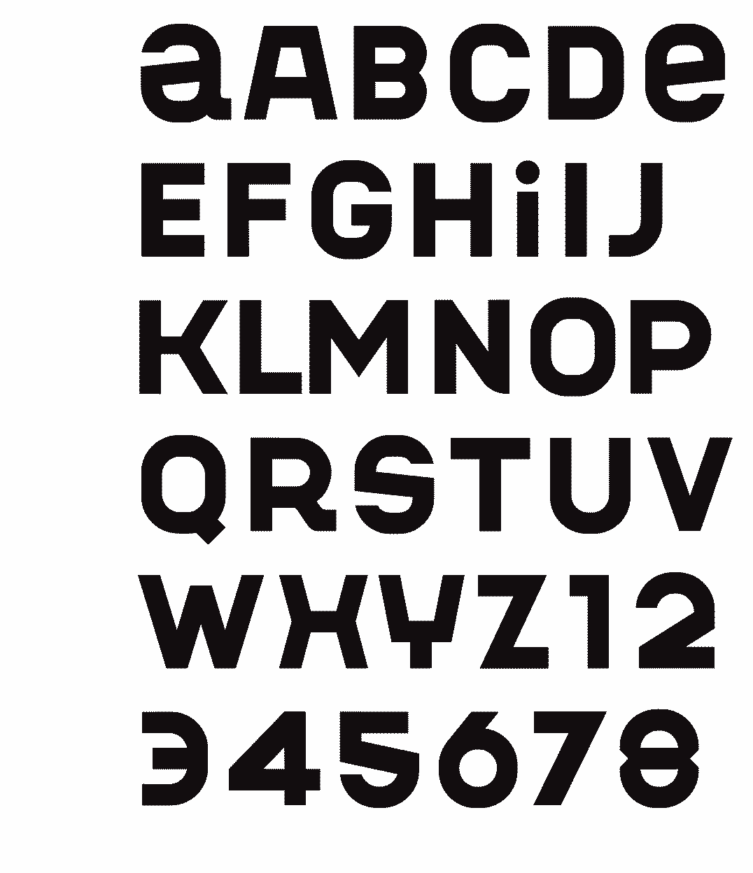
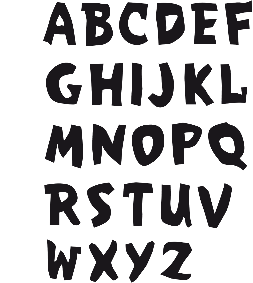
SNARKY
FONT NR. 33
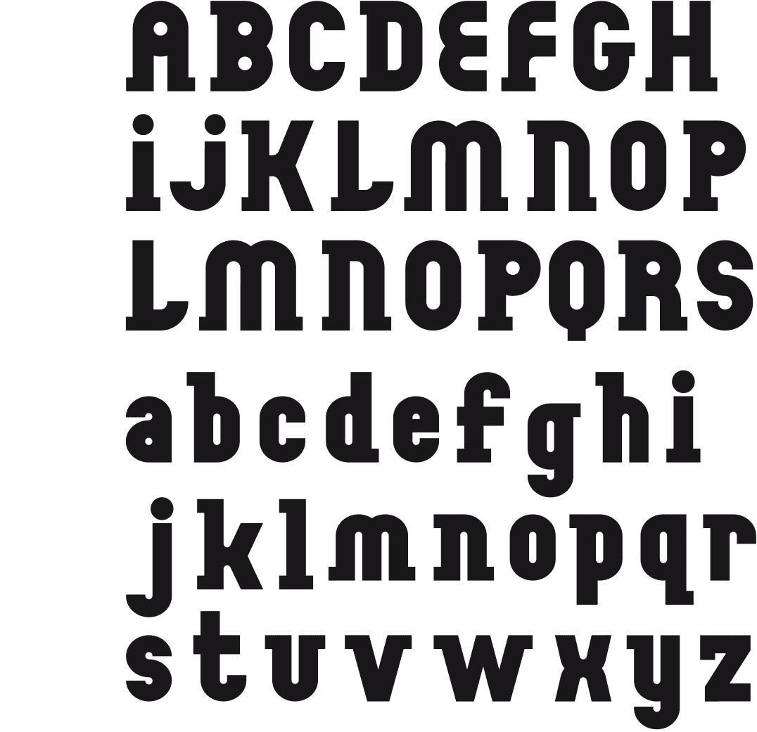
[2025] A bold and playful font with capital letters and, here and there, lowercase letters that may surprise the viewer. I had this font in my list of ideas and unfinished fonts. I tried several times to create it, without success, because I always stumbled over certain characters that did not match.
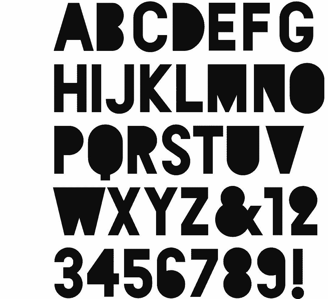
OMBRA
A DARK FONT
[2024] A font with a great contrast between the black areas and the strokes. It was inspired by fonts like Blackout, Hard Questions, Full Circle, Full Moon On Mars, ... which I did not like to use for the cover of a book by Guido Eekhaut. The result is my own version of this type of font.
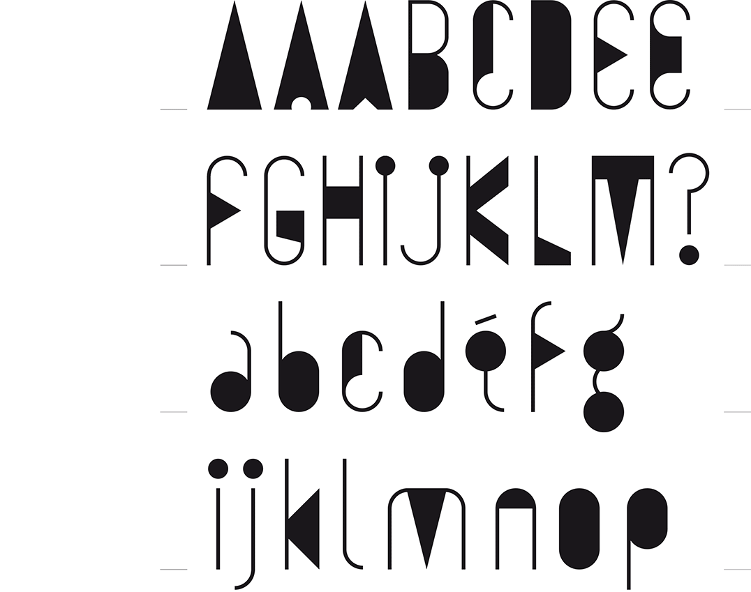
YUKOI
A MUSICAL FONT
[2021] As often happens, in between assignments I was doodling on a corner of a sheet of paper. I drew circles and put tails on them, and soon these musical notes became letters in lower case. I composed a few words to see how the proportions worked. I arrived at a light-dark game of heavy surfaces and fine lines. The playful contrast between the two appealed to me. I quickly set aside my assignments to continue playing. Just like its name 'Yukoi', this font breathes an Oriental atmosphere.
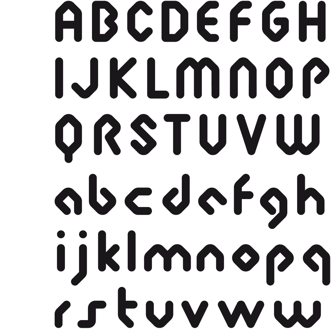
GRIDDO
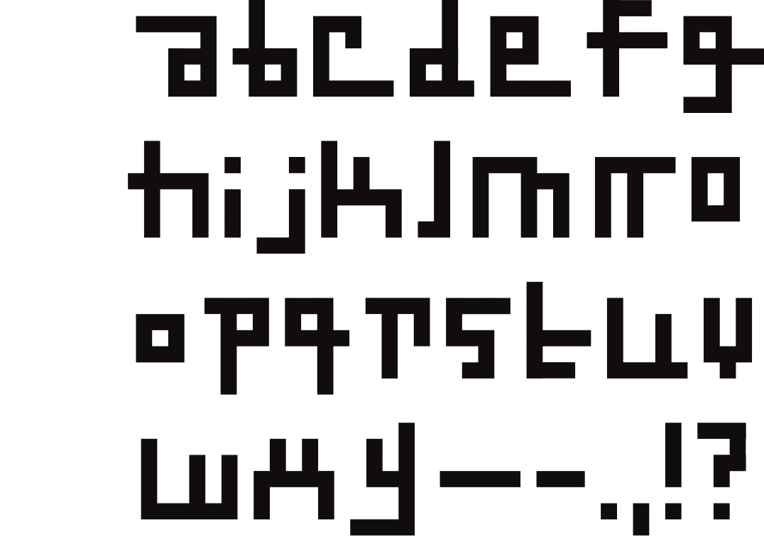
DESIGNED ON A GRID
[2019] I was commissioned to realize the logotype for a department of a French university. In one of the proposals, I made a grid as the basis for drawing the letters.
Eventually, another of my proposals was chosen. Nevertheless, I was so enthusiastic about this grid that I continued to build on it.
Countless fonts were already designed on a grid, so I wanted to use this grid as a basis to play freely, with the intention to bring the letters to the edge of legibility.
TONTONTATI
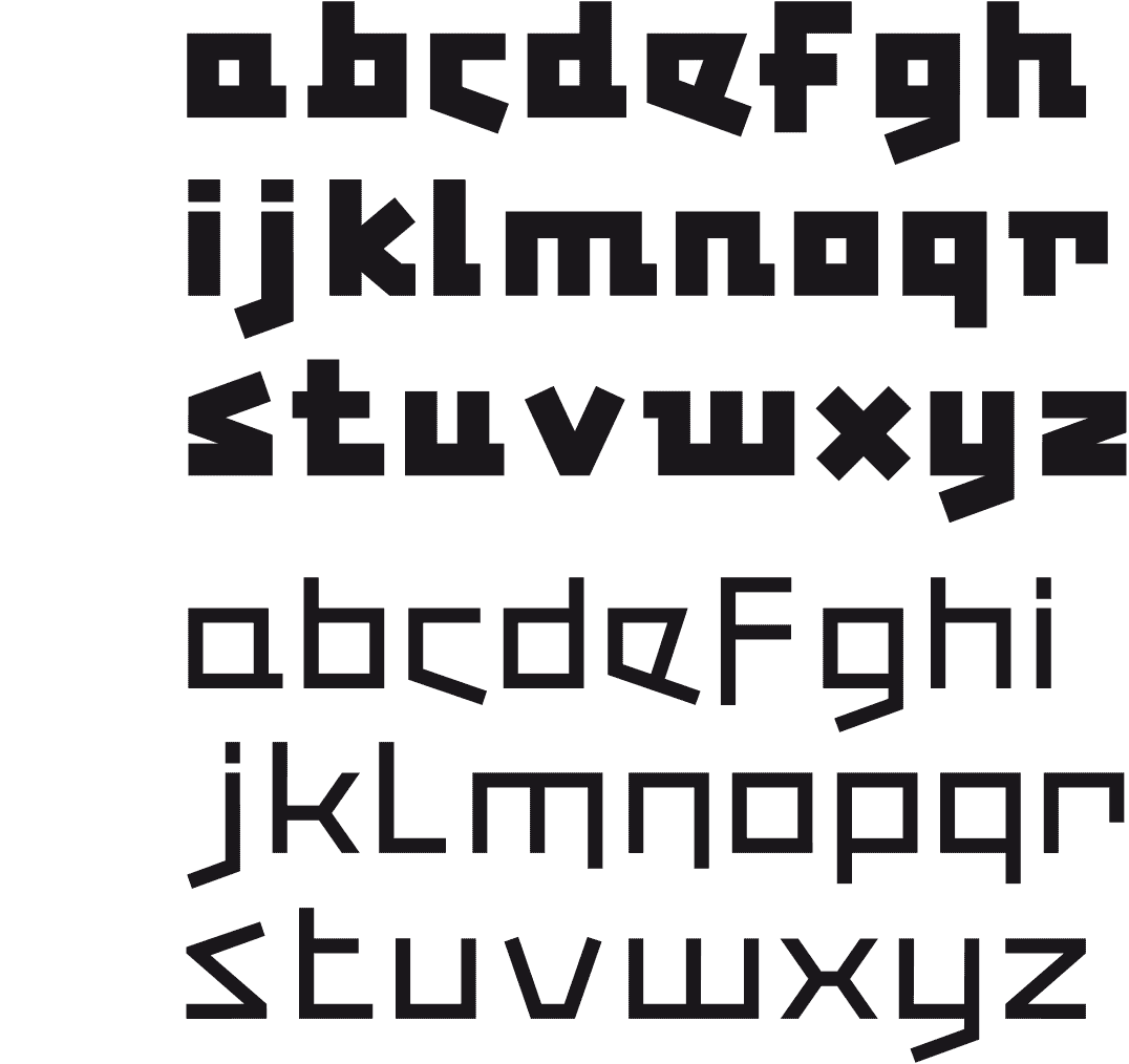
BAUHAUS INSPIRED
[2019] This typeface was created as I was designing a poster for the exhibition «Jacques Tati & Friends» in 2009, a tribute to the famous French director.
In order to have a matching font I drew the letters in a ‘creative’ Bauhaus style. When cleaning up, ten years later, I got the first sketches back in my hands. So, I did some further work on them.
This font is now available in a thin and a thick version. One peculiar aspect is that they differ in terms of drawing. I thought that each thickness should have its own specificity, and not be a mere variant.
WOYDA STENCIL & STYLE
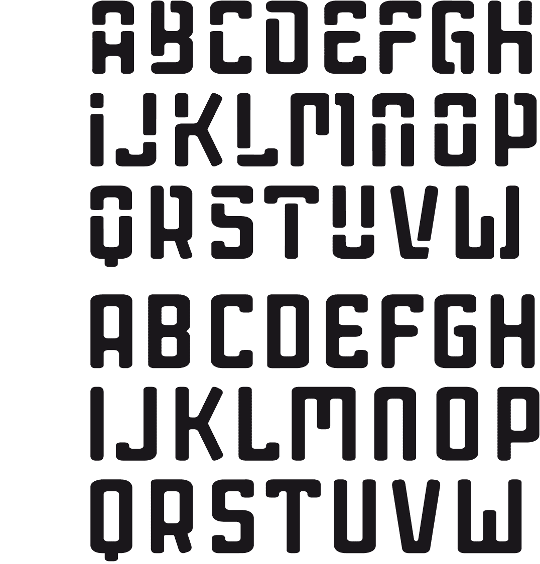
CUT OUT IN METAL
[2017] I was asked for a fitting font to cut out of a metal base of a three-dimensional work. I browsed through stencil fonts but didn’t find anything useful. Most of them have rather wide characters and are not very original. As usual my playfulness (or was it vanity?) got the better of me and I just had to rise to the challenge.
I then realized a regular font from this stencil font.
QUODIC
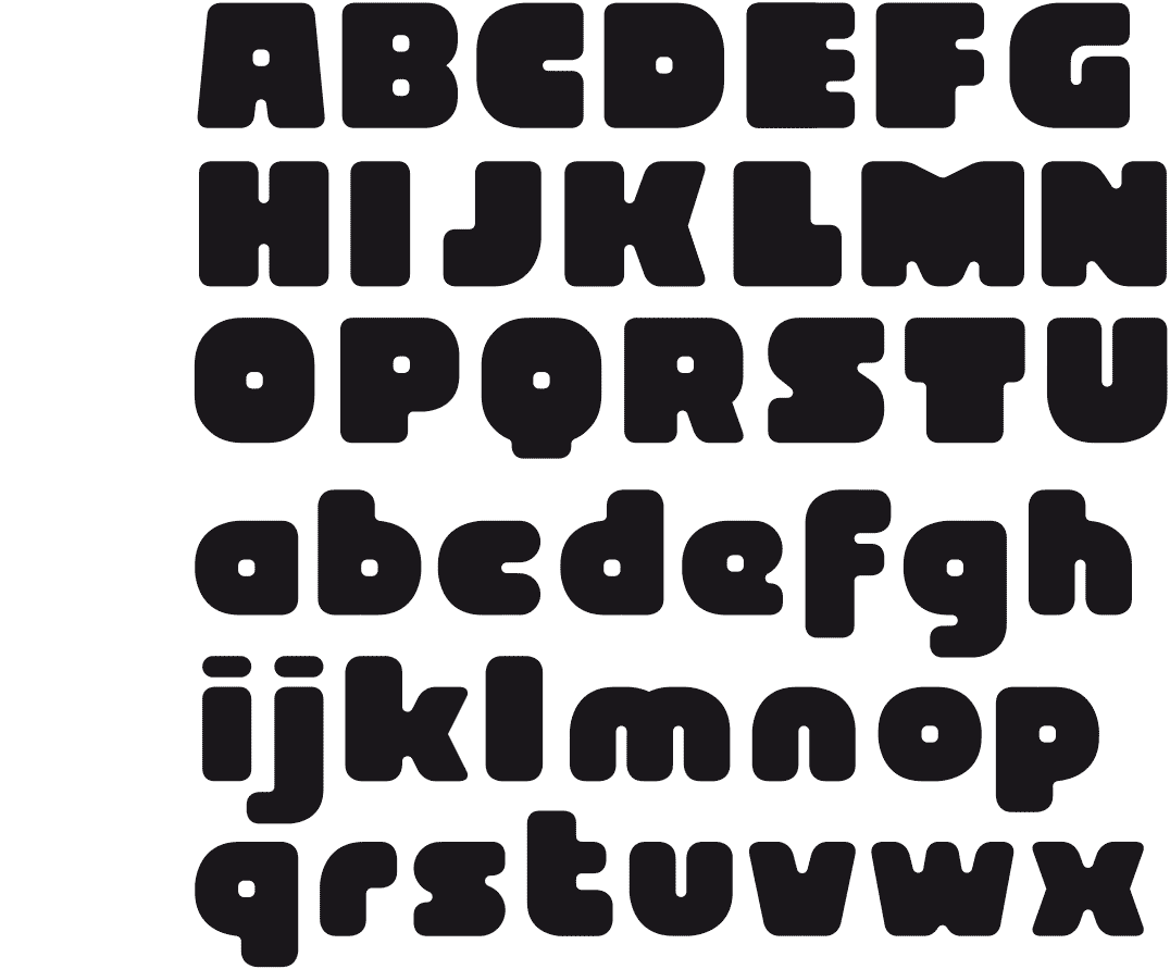
ROUND AND STRAIGHT
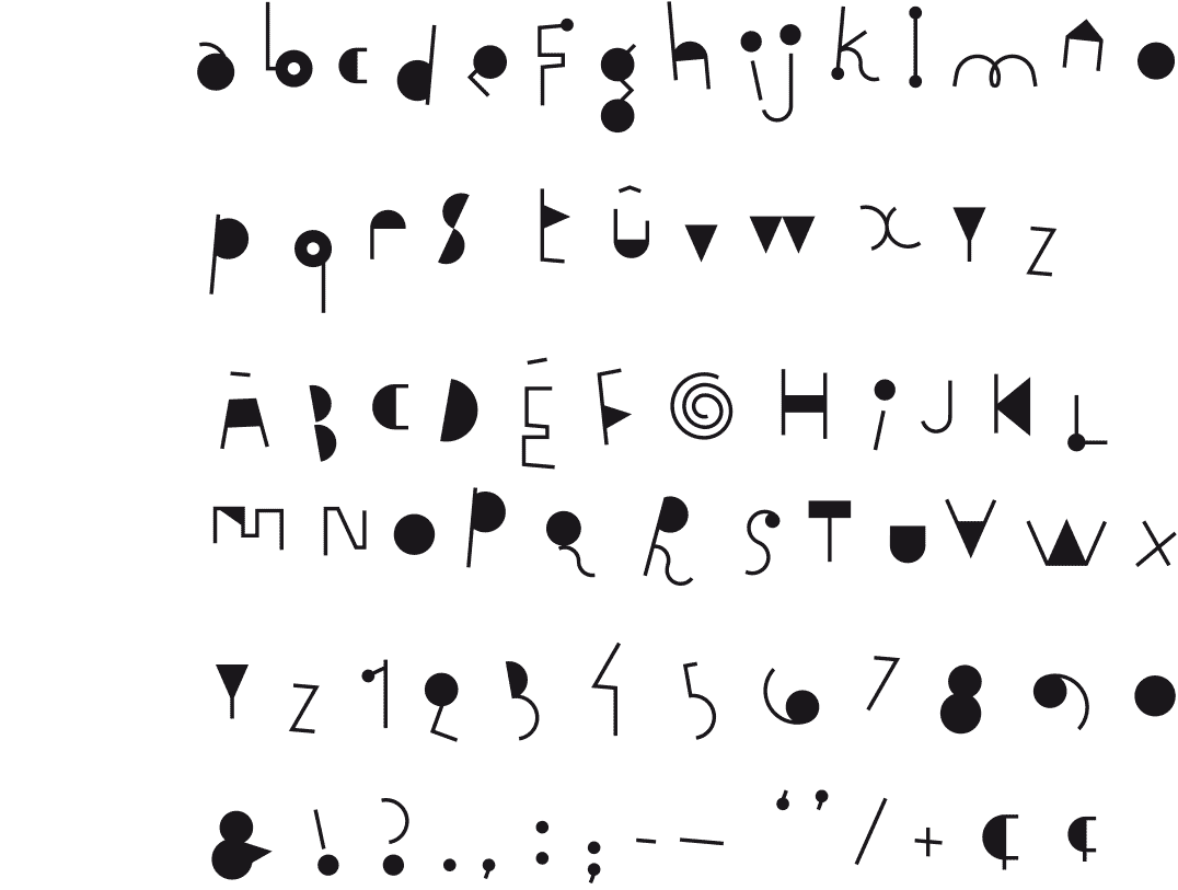
[2015] I was playing with round and straight shapes, making abstract compositions with them. Eventually this resulted in a font whose characters consist of four elements. In compiling the characters I gave each of these forms their own color, to distinguish them from one another.
The final result is a heterogeneous and playful font, on which I worked with great pleasure.
ROSWELLIAN
ALIEN INSPIRATION
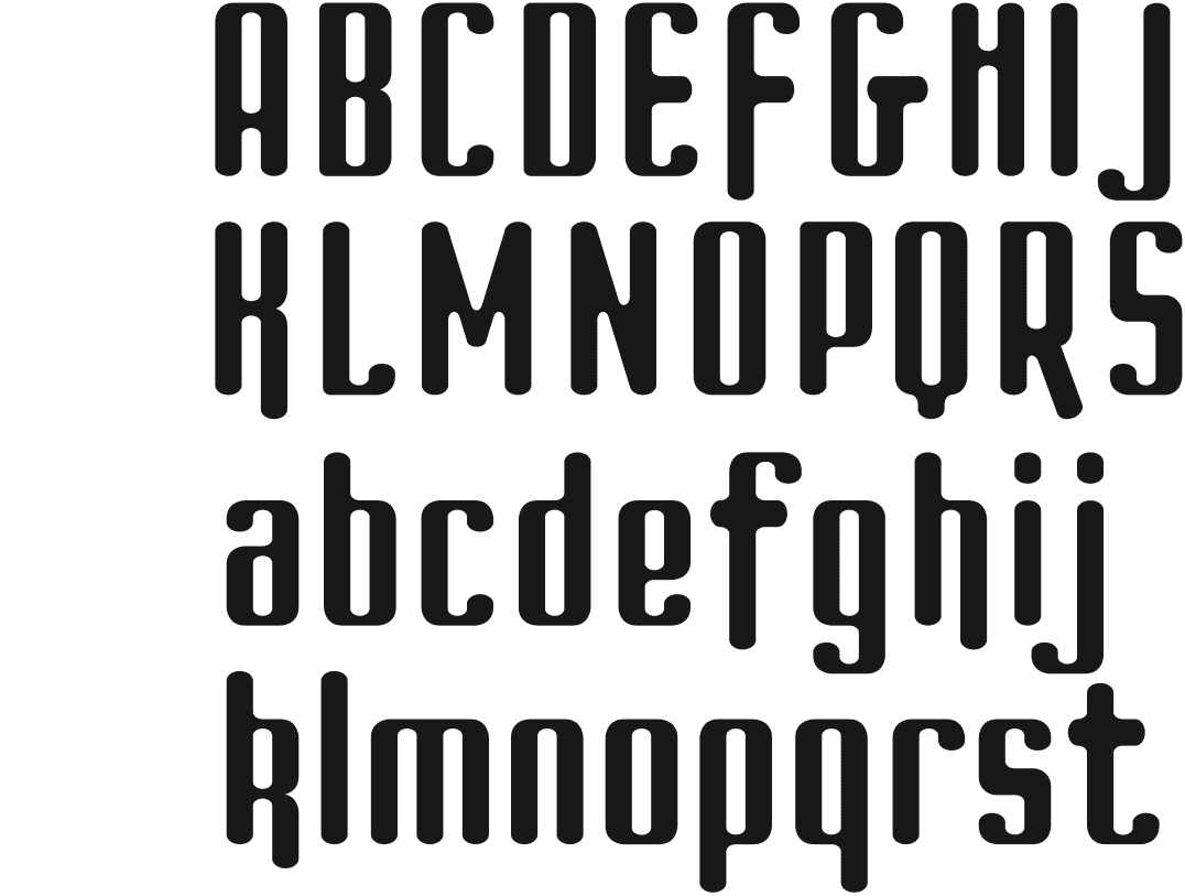
[2013-2015] The design and fine-tuning of the Struktura Font, highly engineered fonts began to take its toll, my enthusiasm to continue had crashed ...
I wanted to go for a more playful and looser approach. Because this font gives a rather strange alien impression, reminiscent of a kind of hieroglyphics, I gave it a name that refers to the Roswell incident.
STRUKTURA
TEXT FONT
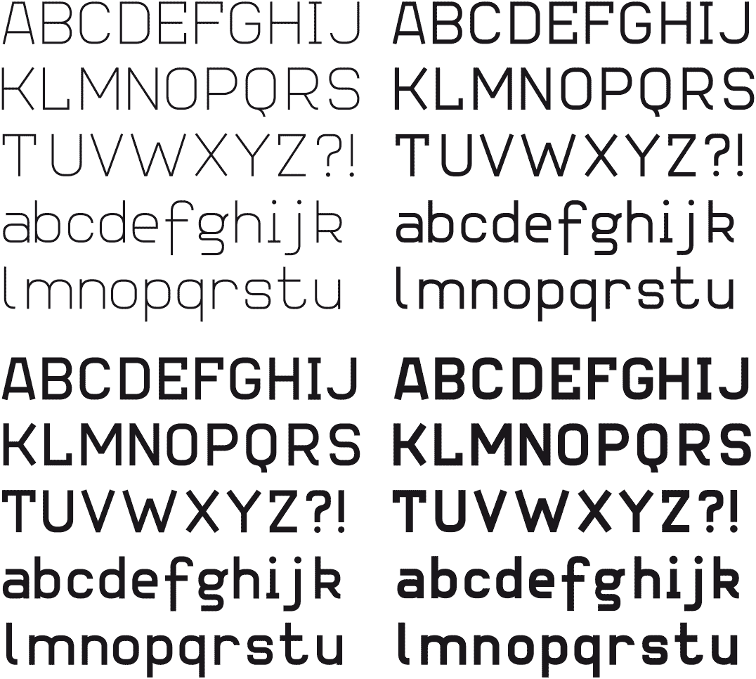
[…-2015] For several years I have been trying to design a text font. I know, it’s aimed very high. Especially for someone like me who works in several disciplines. While designing this Struktura font I had landed on a rollercoaster of doubts and hesitations, and at the same time hope.
Occasionally there was satisfaction but this was mostly of very short duration. It has taken several redesigns of the font, even of all weights, till the shapes eventually formed a whole.
ENOZENO
AN NEAR LOST VERSION
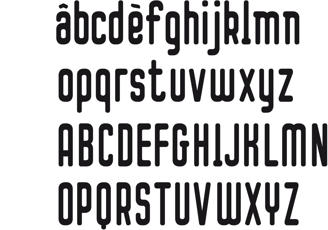
[2012] Sometimes I am so deeply immersed in what I’m doing, that I get lost, as happened now. During the stylization process of the Blackblanc font I had, without realizing it, moved farther and farther away from the original font shape. Eventually it was no longer compatible with the original Blacknoir font. So I had to start it all over again ...
In retrospect, I noticed that this version had potential as a separate font.
BLACKNOIR BOLD & REGULAR
A DROP-SHAPED FONT
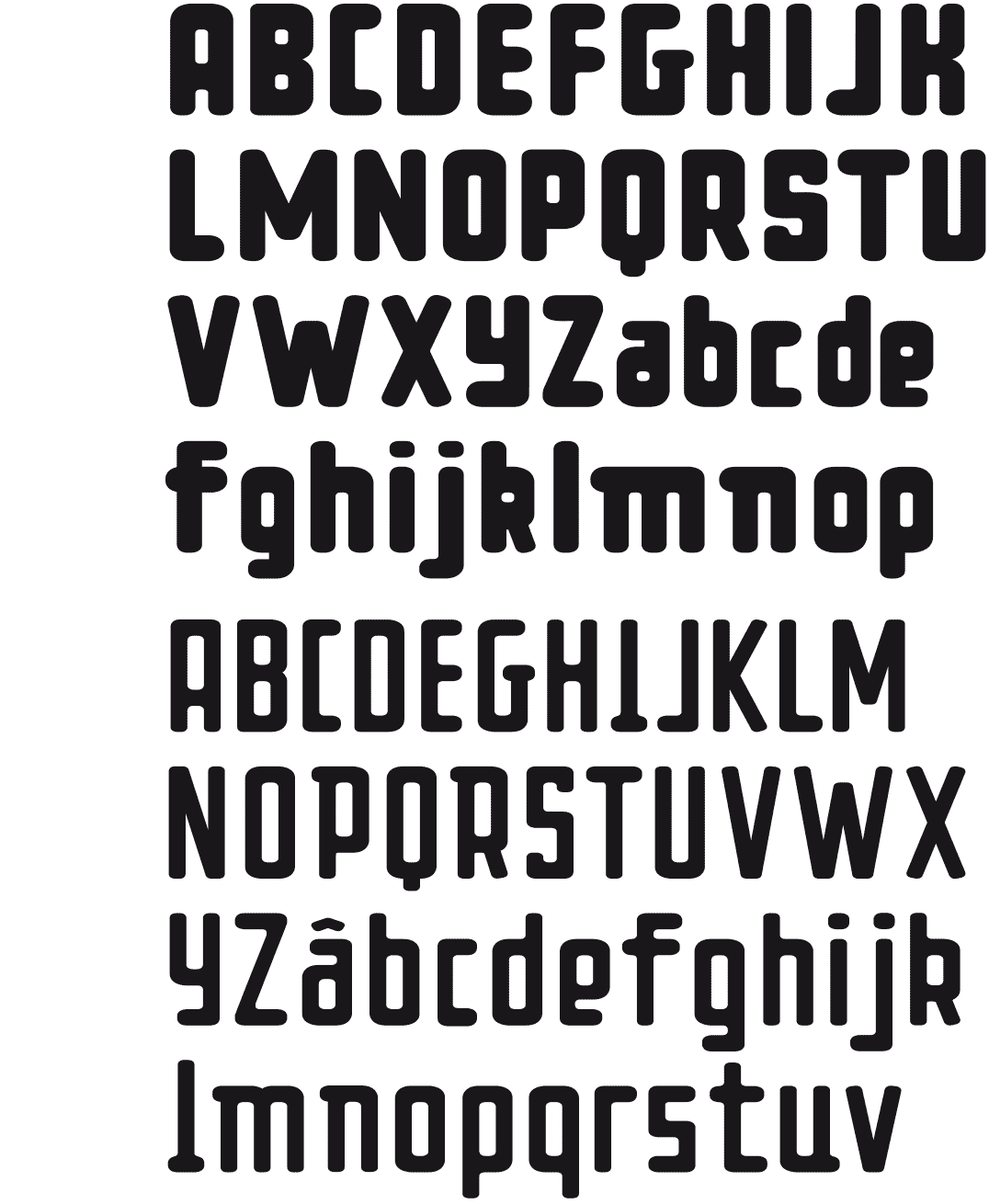
[2012] I tried to construct a font on the basis of oval-like shapes. The intention was to obtain a drop-shaped font type, consisting of spherical black characters. At the same time I wanted it clearly constructed, and not a freehand drawing. The result was not optimal, therefore I quickly passed from oval to rounded rectangles. Building up the letters this way was more efficient, and the results were nicer.
FRIDADIDA
HAND DRAWN TEXT FONT
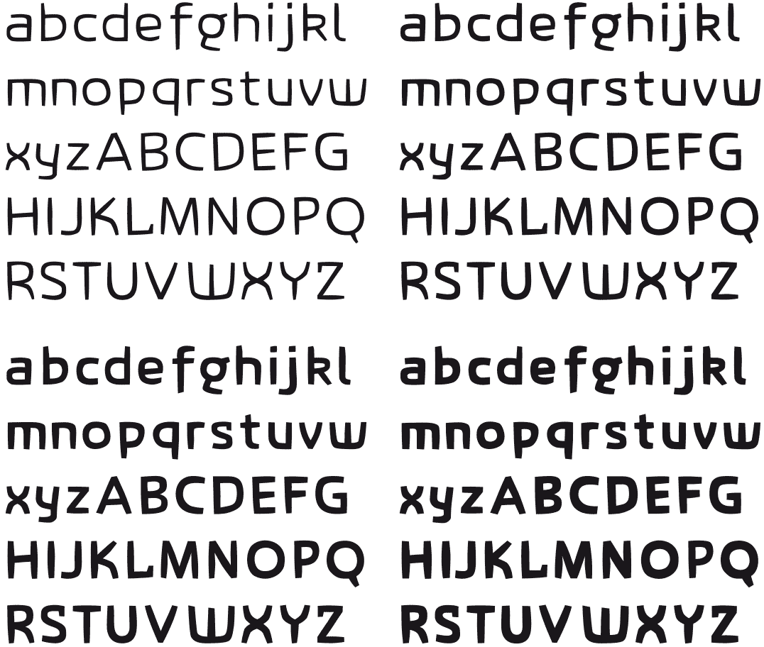
[2005-2009] I made the first drafts of this font in my sketchbook. This ‘handmade’ approach gave the letters curved lines and a spontaneous look. Transferring it onto the computer I put the Frutiger font under-neath as a safety net, never copying it. I wanted this font family to be readable, even in small heights.
ARCHIE TECK
ARCHITECTURAL
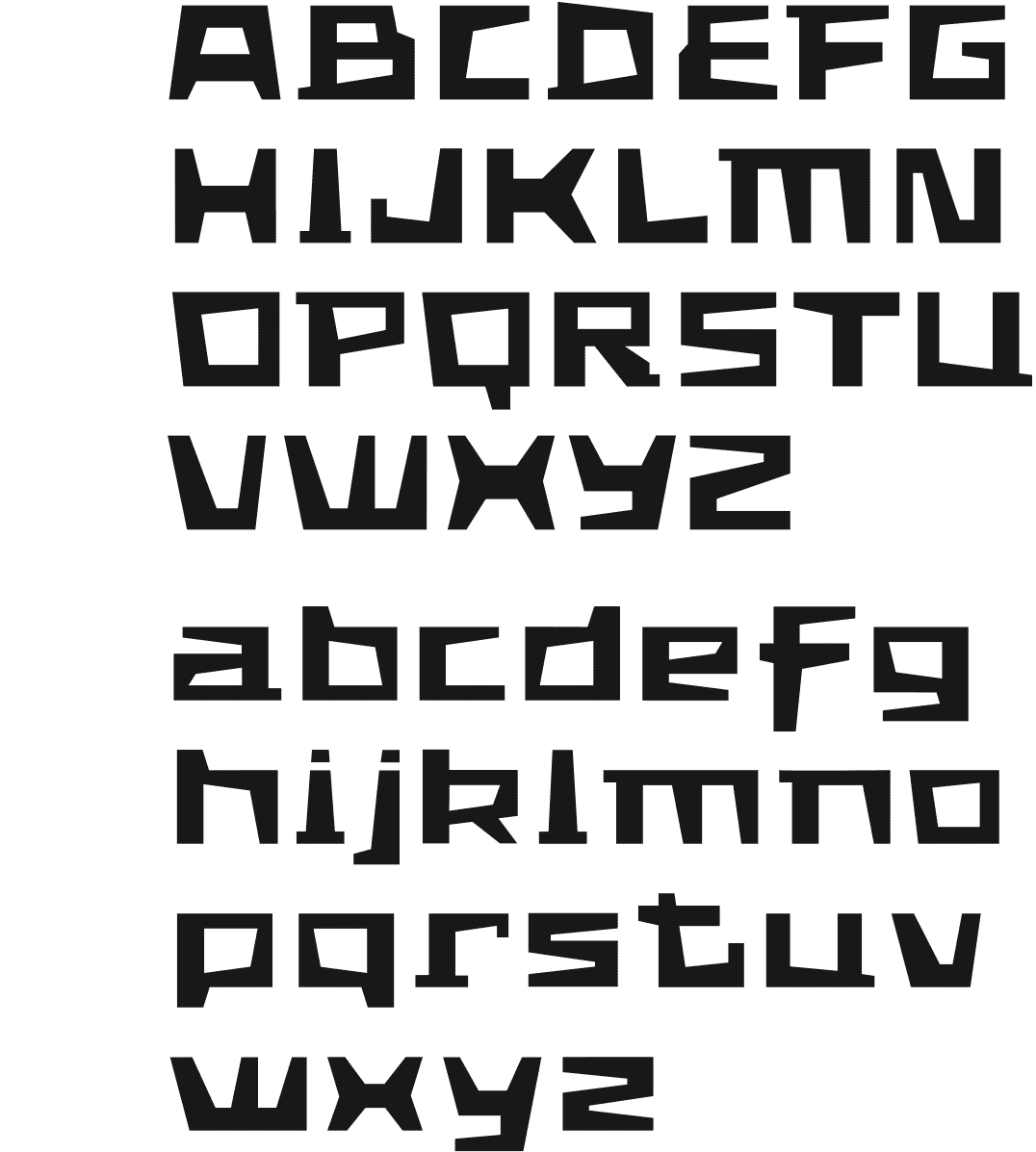
[2003] The request of an architect friend to create his business card, incited me to design the letters of his name in architectural shapes, the result being this constructivist looking font that is inspired by life in big cities.
The ArchieTeck-font has broad basic shape, straight cutout forms and small outbuildings.
BLIND LIDDY
A DRAWN BLIND FONT
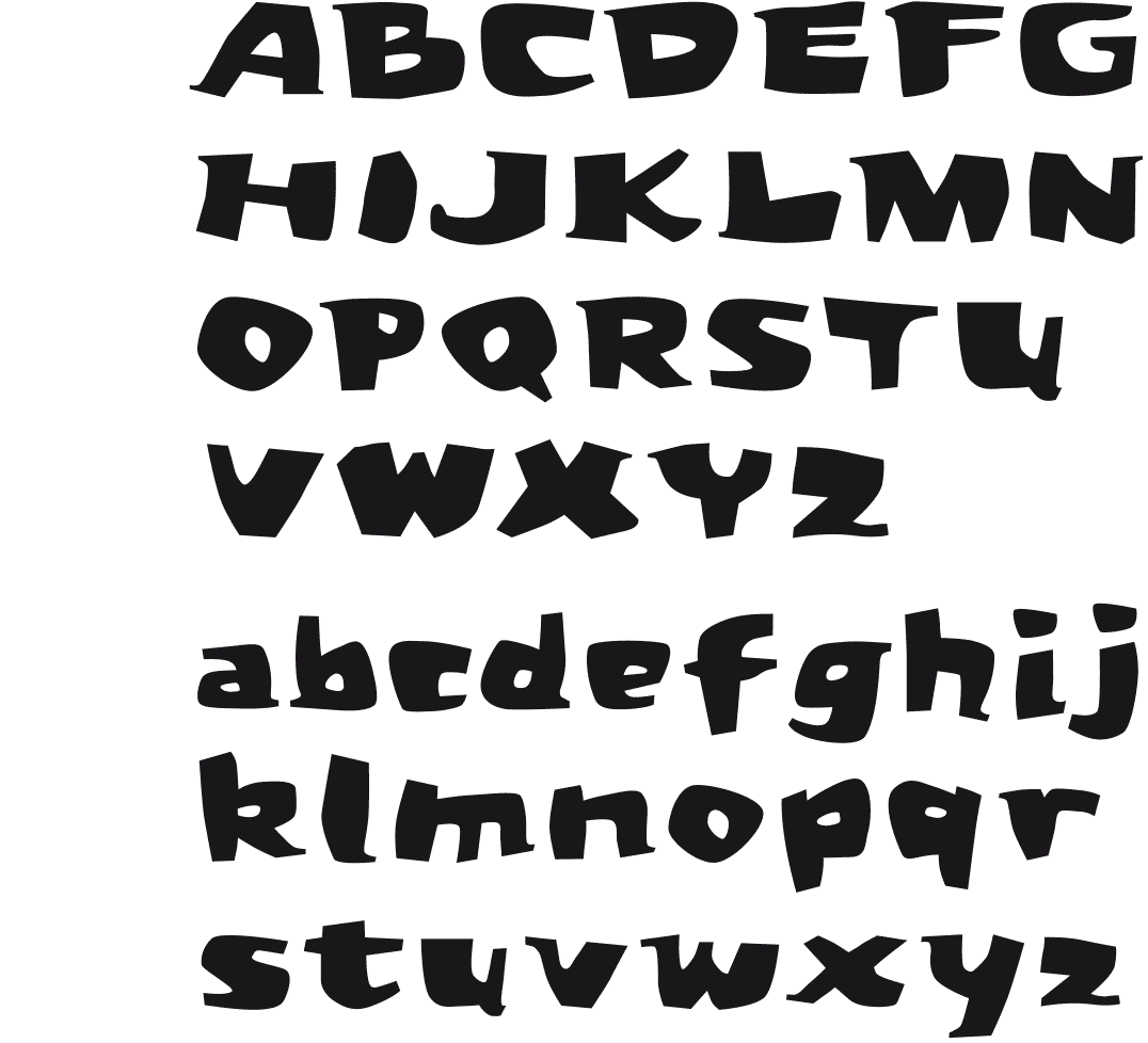
[2003] One day when I was bored and just looking around, I had the idea to close my eyes and let chance do the creative work, instead of me consciously trying to design. I started by making random points and curves with the computer mouse and ended up with some really bizarre forms. Then I tried to make some letters.
As the result was quite funny, I kept going on blindly making the other letters. Afterwards I worked on the shapes to give the font some degree of coherence.
THEO & PHIL
POP ART
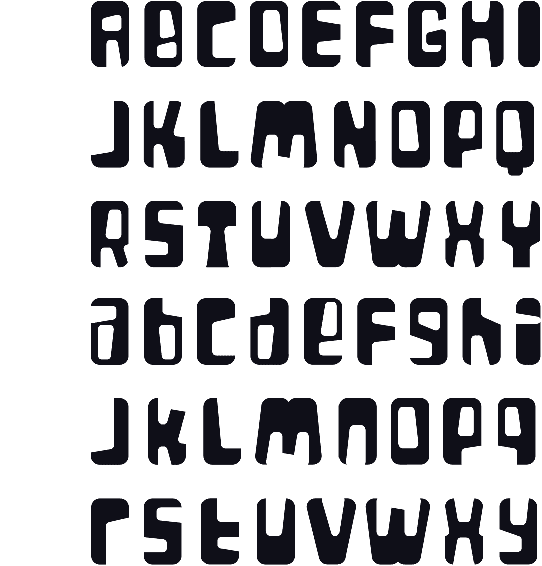
[2000] The inspiration for this font came while I was working on a logo, playing with a black rectangle with rounded corners, from which white rounded shapes are cut out. In the end, I didn’t make a logo that way, but I did end up making a font that consists of shapes instead of lines. The font has a pop-art look that gives it a special sixties feel.
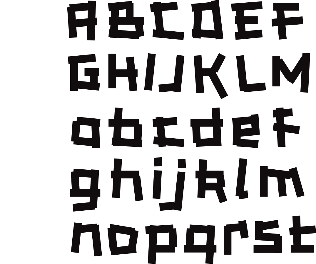
CAKEWALK
ALBUM
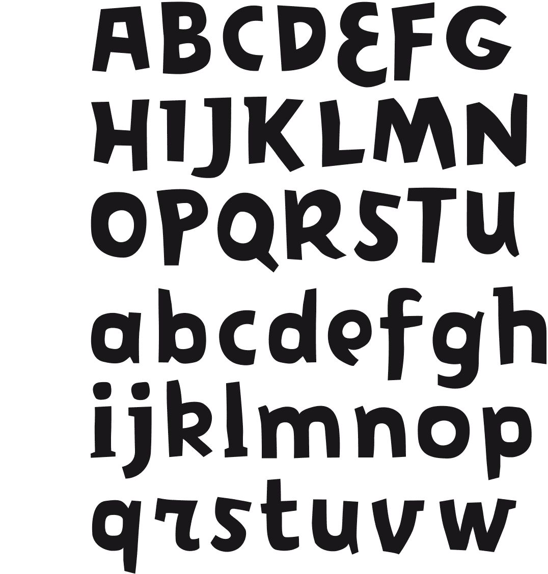
[1999] The idea here was to get rid of base-lines and letter heights to make it look almost as if the characters were dancing on paper. While designing the font, I had to be very direct without having to bother about issues such as construction or form. So, I made words quickly, clicking with the mouse, drawing several times the same letters so they would interact with each other. This direct approach resulted in a paper-cut effect.
ZUZULMA
WOODEN LETTERS
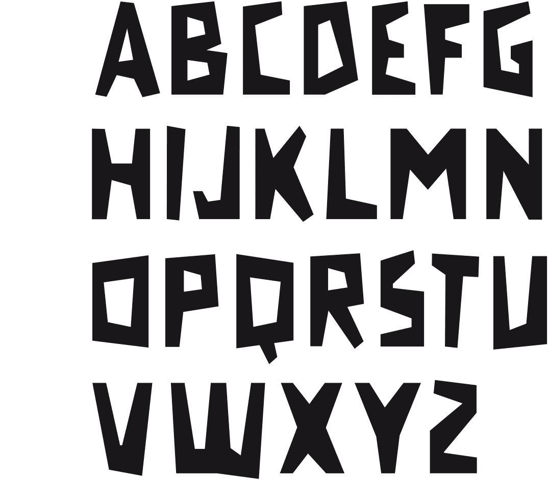
[1997] This font came about in a very natural way, one day I was using the mouse to draw a poster in Illustrator. I had to put in a title and drew it in quickly, just to see the size. That was the start of this font. In the end, it looks like a linocut type. It makes me think of the wooden letters at the entrance of ranches in Western movies.
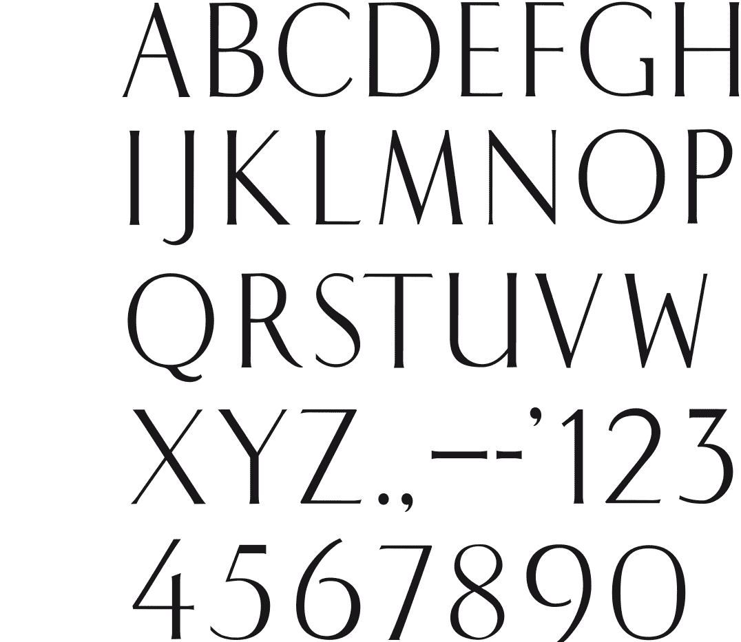
BRUXEL
JACQUES RICHEZ REDESIGNED
[1996] I was looking for a suitable typeface which to set the names of a series of carpet brands, and found nothing elegant and fine enough. So I thought of this type by Jacques Richez seen on a poster of the 1958 World Fair in Brussels. The font is classic of view and shows great skill. Especially, that posters until the 60s, were realized in lithography, and texts were drawn by hand or transferred using templates. The typeface has a nice tension between the different forms, it is gracefully styled especially when used in large sizes. It could be a derivative of a calligraphic as used by script sculptors.
To obtain certainty I submitted this issue to the typographer and graphic designer Dooreman. His answer: In my opinion it’s an amalgam of several fonts. We find the typically U in ao Perpetua, the B and R are very antique (Garamond, Van Dijck, ...) but above all it is a hybrid, not a true serif. The ‘serifs’ tend to Optima. I suppose it’s an original design.
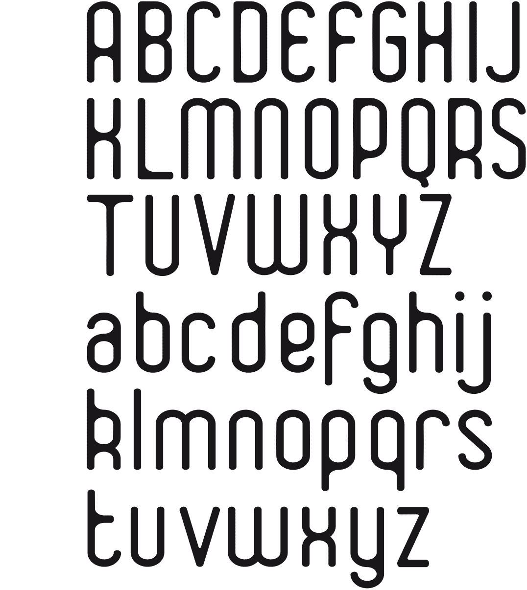
DELPHIS
ROUND SHAPES
[1993-2015] The first version of this typeface was drawn around 1993. As I was dissatisfied with the design, I let it gather dust it in my drawer, until I radically redesigned it in 2015. It’s a typeface with rounded ends and round shapes, referring to typefaces from the seventies.
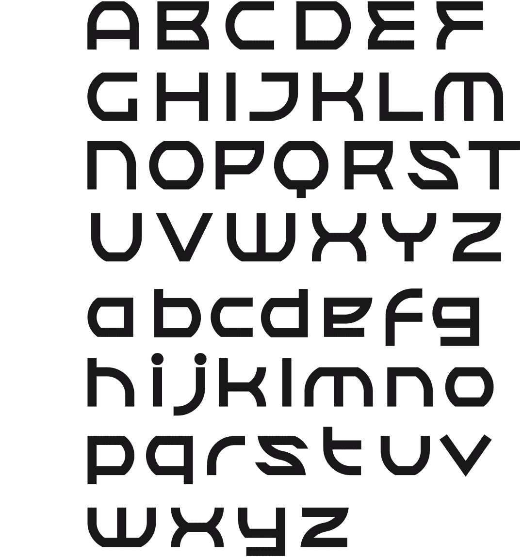
XORKAZ
A RUSSIAN LOOK
[1992] A solid font with a nod to the Russian posters from the 30s and 40s. There are no flowing forms, the letters are highly structured and abruptly change from round to straight shapes. A first version of the font was not satisfactory.
A makeover gave the font unity and strength.
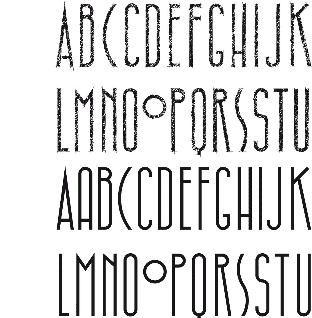
HIBBLESIBBLE
HATCHED AND STRAIGHT
The first characters of this font were designed to serve as the title of the poster. It’s a tight and narrow font, all drawn by hand, even the hatching. It was drawn on tracing paper with a 2B pencil, at a size of 7 cm. Afterwards I felt the need, as a contrast, to design a straight version of this font.
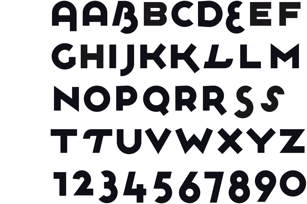
PLOWBOYS
PLAYFUL AND STRONG
[1987-1996] While looking for a logotype I started to play with round shapes. For some letters like the E, S and B, I used two circles. In the same logic the O was one circle, and therefore smaller. All the straight letters were given the height of the O. This way, it became a font with 2 different heights, with all of the letters aligned at the top. The end result was this solid yet playful font.
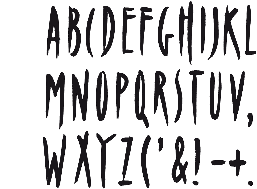
URBAS
GENTLY CONSTRUCTED
[1976-1977] However, this is not a geometrically conceived typeface, the structure appeared only after-wards. I started outlining some key characters, trying to find a structure that would serve as the basis for the other characters. Such a structure is an underlying instrument used to obtain a homogeneous whole, however, it is not visible in the final result. It was a great surprise to receive this beautiful grid as a result, and then to see the other letters fit gently into it.