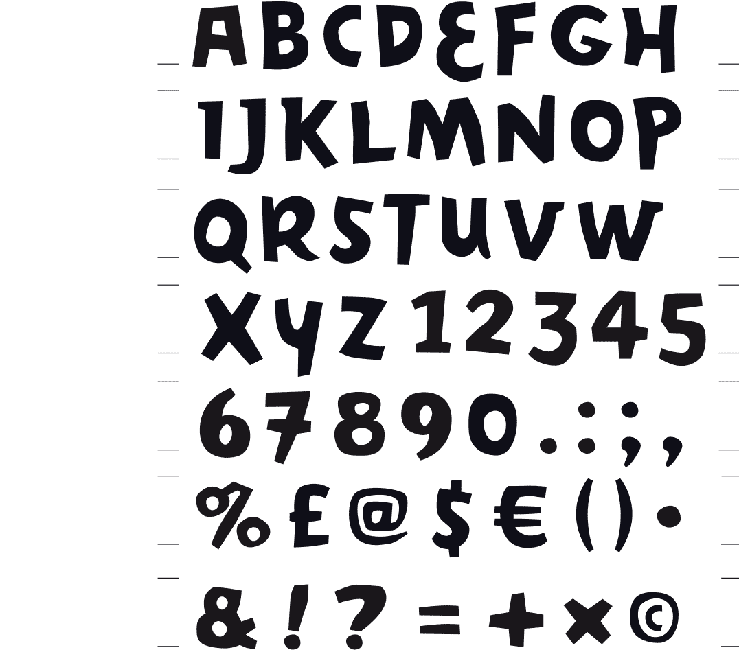
First draft of this font, below the consecutive design phases
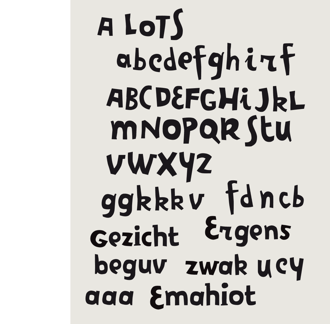
First draft of the Cakewalk font – the lower case was finished in 2017 on request of a customer
 BACK
BACK
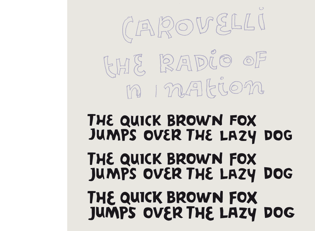
CAKEWALK
DANCING ON PAPER
[1999] The idea here was to get rid of base-lines and letter heights to make it look almost as if the characters were dancing on paper. While designing the font, I had to be very direct without having to bother about issues such as construction or form. So, I made words quickly, clicking with the mouse, drawing several times the same letters so they would interact with each other. This direct approach resulted in a paper-cut effect.
Issued in OpenType by Index Books (Spain/Brasil) as part of the book « Homage to Typography » by Pedro Guitton 2009
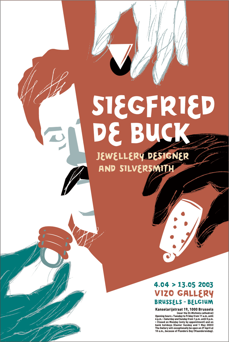
Poster exhibition « Siegfried De Buck », VIZO - Design Vlaanderen Brussels 2003
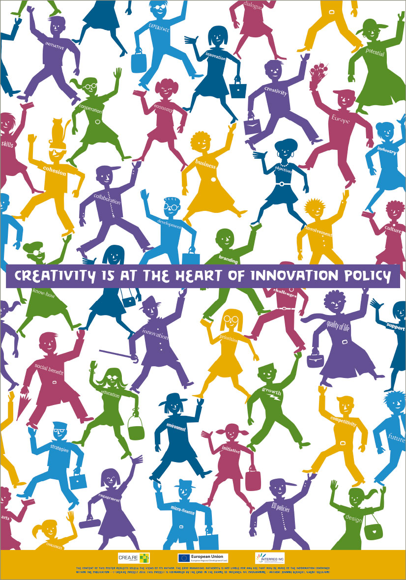
Poster CREA.RE (Creative Regions) project - motivating the creative sectors in the economic and social development of European regions and cities 2012 « poster exhibition

Logo ‘Food Quality Institute’ Brussels 2008, not retained
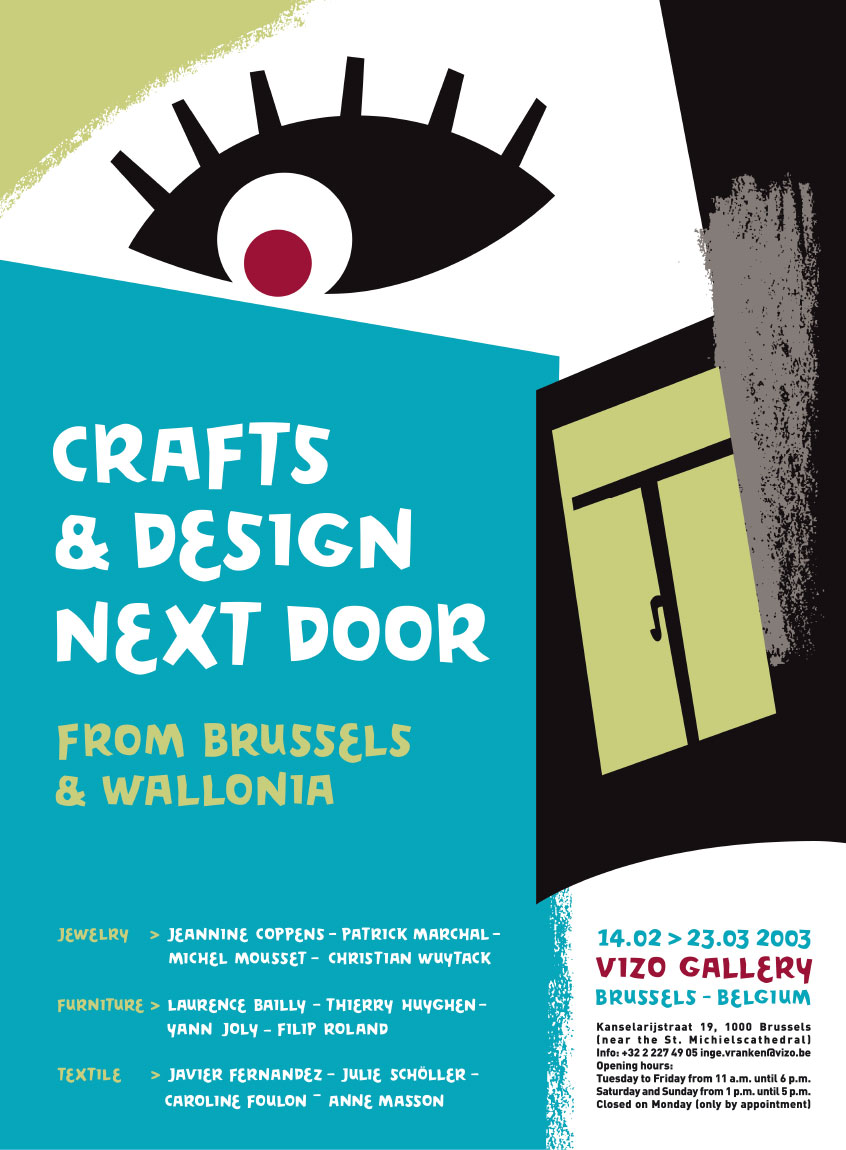
Poster exhibition « Crafts & Design Next Door / Gluren bij de Buren », VIZO - Design Vlaanderen Brussels 2003
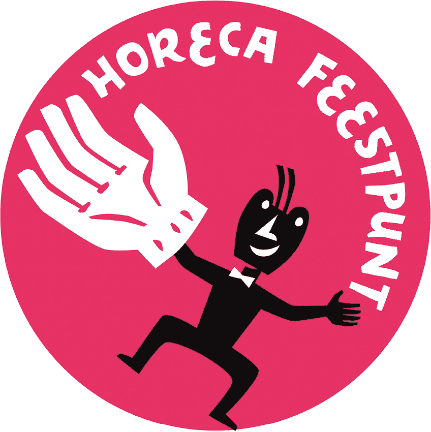
Logo to promote the catering industry at the Gentse Feesten