Rogers & Goffigon
USA
Rogers & Goffigon is a designer of high-quality home furnishing textiles. Their fabrics are manufactured exclusively at small European mills, where skilled craftspeople employ traditional artisanal techniques using natural fibers and a palette often influenced by vegetable dyes. The collection features a spectrum of textures, weights, and colors, with designs inspired by historic textiles and patterns found in nature. Rogers & Goffigon has showrooms in New York, Chicago, Washington, Dallas, Florida, Houston, Los Angeles, San Francisco and Canada, and representatives in Europe, Australia, New Zealand and South America.
Keywords logo: personal approach, textile, personality, positive, artisanal, natural, to stand for, signature.
DIVISION SPATIAL INTELLIGENCE
FRENCH UNIVERSITY
2022 / Several components and departments of the Université Polytechnique Hauts-de France (UPHF) have chosen to align with the new corporate identity.
The keywords for the creation of this logo are: space -society - individual - intelligence - world - eye. The logo of the Space Intelligence Chair reflects the image of an institution that evolves both in continuity and in openness to change.
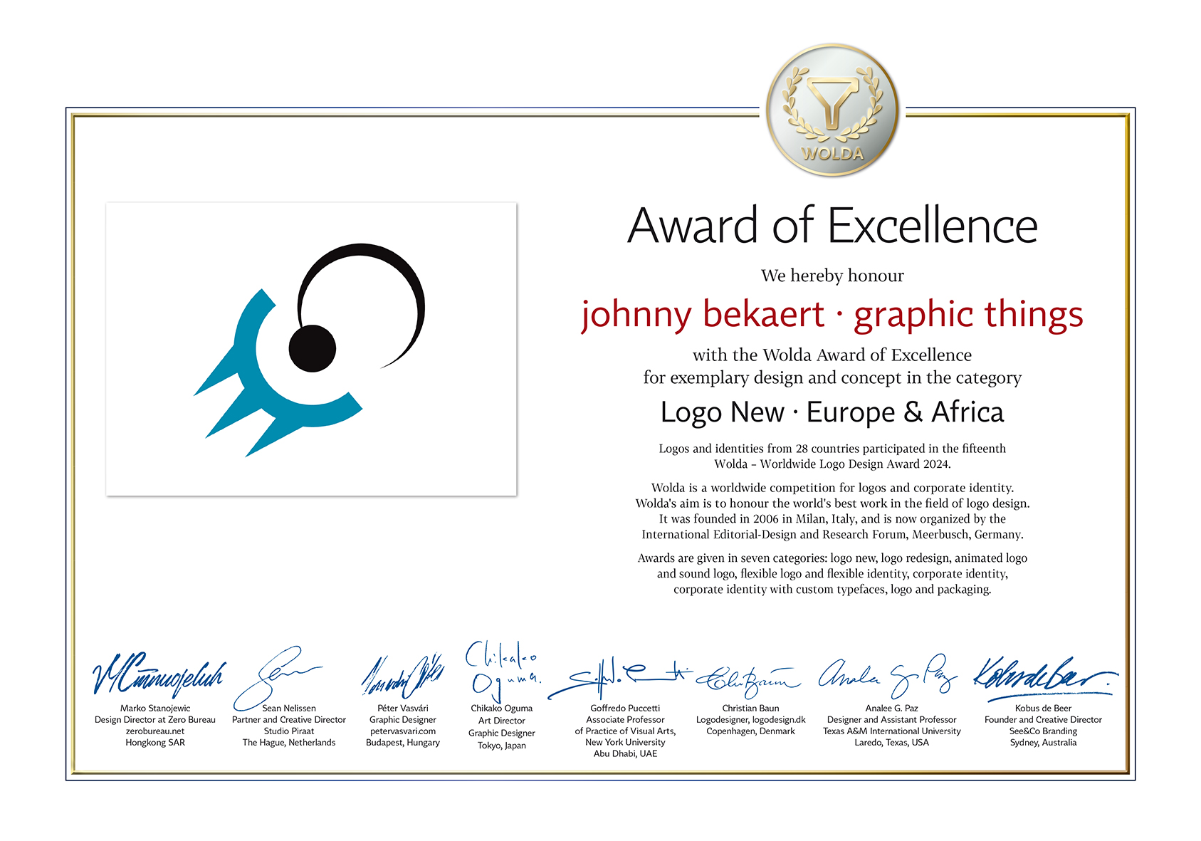
‘Award for Excellence’ – Worldwide Logo Design Award (Germany)
FRANCE
2024 / The Chair in Tourism and Heritage Enhancement is a tourism development and heritage enhancement programme created within the Hauts-de-France Polytechnic University (UPHF).
The aim of the programme is to develop a new form of sustainable tourism in an area with a rich and varied heritage (literature, mining, water, forests) and a particularly rich history dating back to the Middle Ages, which is being promoted and showcased thanks to the concerted work of an interdisciplinary team of local and international specialists.
The visual signs represent dome, roof and gate, while also representing protection, evolution and solidity. The whole stands for constructive exchanges, openness, diversity.
INSTITUT SOCIÉTÉS & HUMANITÉS
FRANCE
2019 / The ‘Institute Sociétés et Humanités’ (ISH) is a component of the Hauts-de-France Polytechnic University: Literature, Languages, Arts; Economy, History, Geography, Societies; Law, Public administration; Management.
ISH is located on the Valenciennes and Cambrai campuses.
The logo is a playful combination of the letters ISH – it radiates humanity, coherence, interaction and connectivity – and is very quirky.
LOGO FRENCH UNIVERSITY
GRAPHIC CHARTER
2018 / The Université Polytechnique Hauts-de France (UPHF) asked us to create their new logo. As usual, we asked for keywords describing the new university: open structure - movement - structured growth - internal / external relations university & economy - interaction.
This multidisciplinary university is located on 4 campuses: Valenciennes (2 sites), Cambrai and Maubeuge.
FROM OLD BREAD
TO PACKAGING MATERIAL
2021 / LOAF FOAM is a student company that originated at the University College of Ghent. They transform bread waste into packing peanuts. With this idea, they want to reduce plastic pollution and the waste stream of bread. Belgium finalist at the Bio-based Student Innovation Challenge Europe (BISC-E) 2021.
8 EUROPEAN UNIVERSITIES
A PARTNERSHIP
2018 / Co4AIR is carried by a strategic partnership composed of 8 European universities (Slovenia - Spain - Luxembourg - Romania - France - Germany - Portugal) involved in Computers, Cognition and Communication (Co3) in control, a field that draws upon computer science, mathematics, telematics, robotics, computer architecture, embedded systems, real-time systems and many others.

SUSTAINABLE TRANSPORT
& MOBILITY INSTITUTE
ENCOURAGING DISCOVERY
2019 / A unique place dedicated to all types of mobility: convention center, place of innovation discovery and resource center. The ’Institut des Mobilités et Transports Durables’ (IMTD) of France is becoming the showcase for tomorrow’s innovations, supporting project leaders in their communication efforts.
ILLUSTRATION AND GRAPHIC DESIGN EXHIBITIONS
BRUSSELS
2008 / The ‘Maison de l’Image’ presents to professionals and the general public what is best in the field of image, graphic design and illustration in Belgium and worldwide.And this in a place where all the media communication and graphic arts professions are represented. Each exhibition is the subject of a limited edition catalog.

PERSONAL PUBLISHING HOUSE
DESIGN AND LITTERATURE
2007 / What started as a publishing house of its own work quickly expanded into other exciting projects with a focus on design and literature. The logo obtained a prestigious ‘Choice of the Jury Award’ on the ‘XIIth Rockport Letterhead + Logo Design’ Massachusetts USA.
PRAXIS OF WRITINGS
AND IMAGINARIES
FRANCE
2020 / DeScripto focuses on the theoretical and practical study of presentation / representation devices for all forms of writing or utterance (linguistic, iconic, vocal, bodily signs) with or without aesthetic value. DeScripto is a component of the Université Polytechnique Hauts-de France (UPHF).
A SERIES OF BOOK EDITIONS
UNIVERSITY PRESS
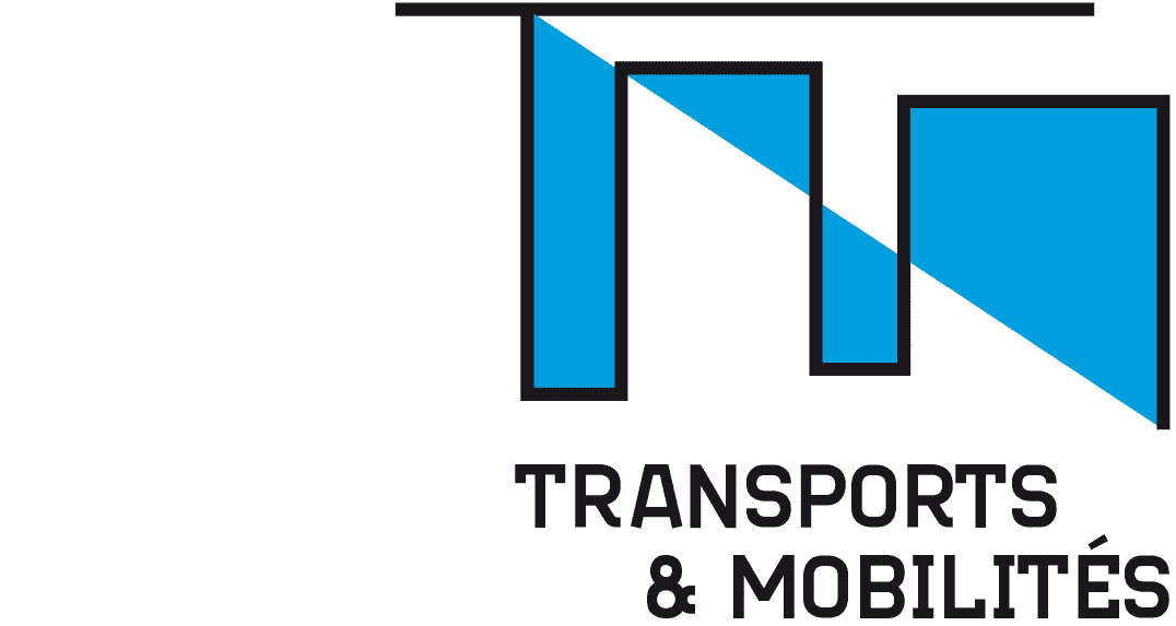
2014 / ‘Transport and Mobility’ is a series of editions published by the ‘Presses Universitaires de Valenciennes’.
The TM logo is in the form of 2 interlaced letters, with the blue dividing line connecting one point to the other: the distance from T to M. The logotype is set in the Struktura font.

VK - VERENIGD KEUR
THE NETHERLANDS
2000 / International insurance company for major projects in architecture and shipbuilding.
