Exploring the possibilities of an ultra black typeface
 BACK
BACK
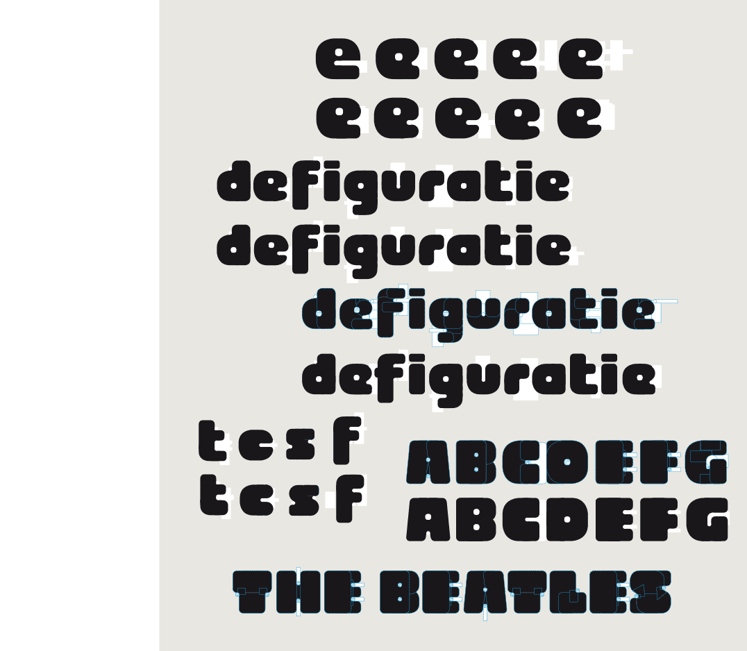
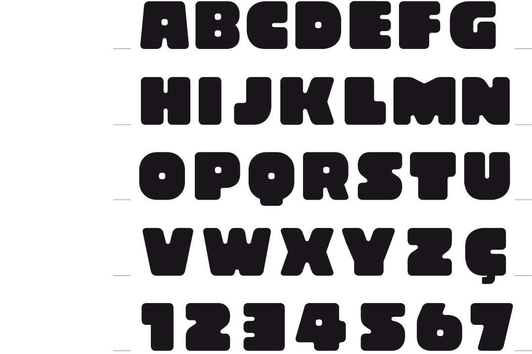
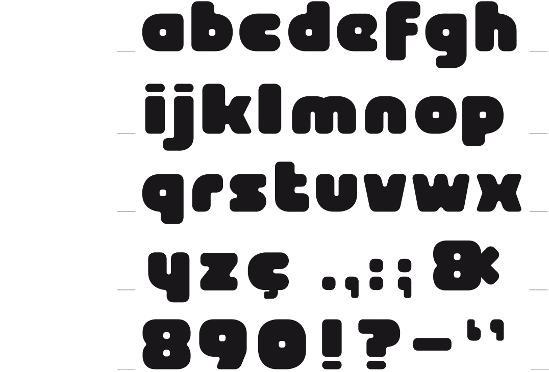
OSCURA
ULTRA SOLID
[2016] Sometimes, for no particular reason, I feel like making a font. This was the case with this typeface. I wanted to see where it would bring me, taking a rounded square as a basic shape. With the intention to achieve an extremely thick and solid font, with very small eyes.
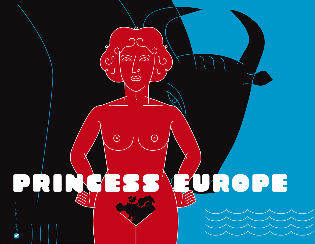
Poster for the exhibition « Princess Europe » - ‘Huis van het Beeld / La Maison de l’Image’ Brussels 2010.
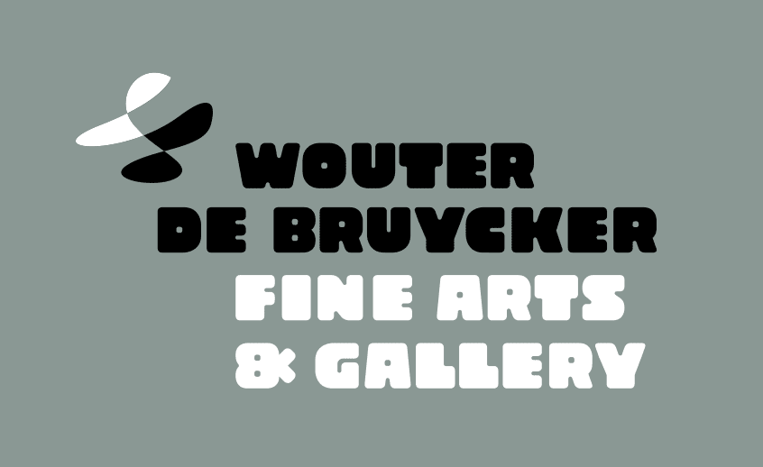
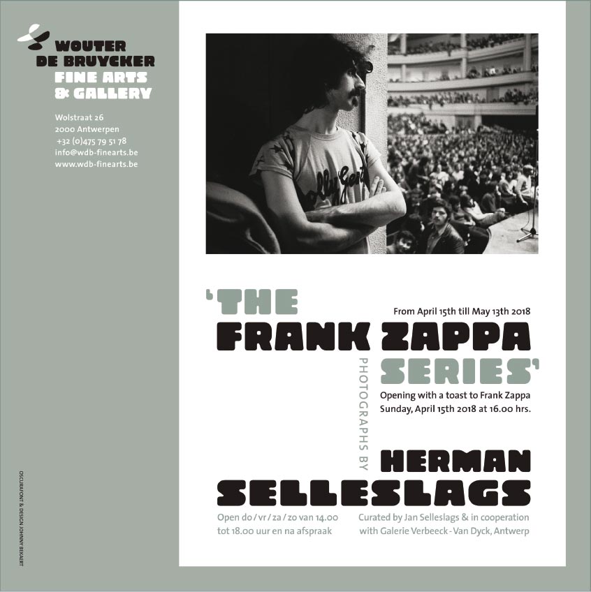
Logo & poster Wouter De Bruycker Fine Arts & Gallery, Antwerp 2018