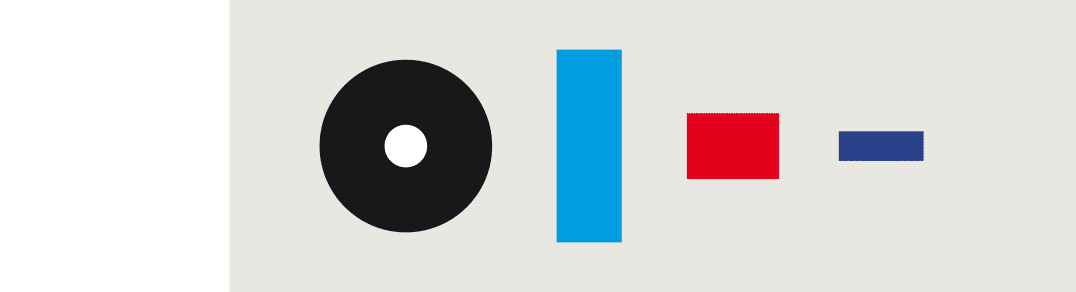
Above, the four building elements
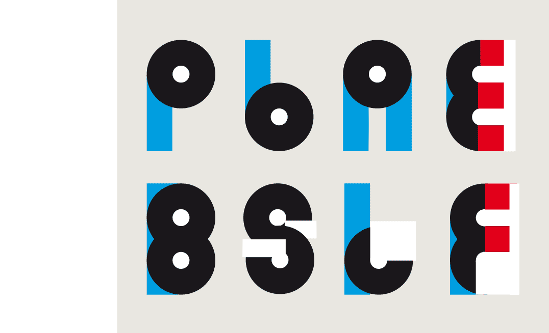
The first characters realized with this method.
 BACK
BACK
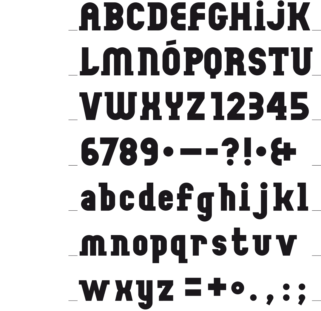
QUODIC
ROUND AND STRAIGHT
[2015] I was playing with round and straight shapes, making abstract compositions with them. Eventually this resulted in a font whose characters consist of four elements. In compiling the characters I gave each of these forms their own color, to distinguish them from one another.w
The final result is a heterogeneous and playful font, on which I worked with great pleasure.
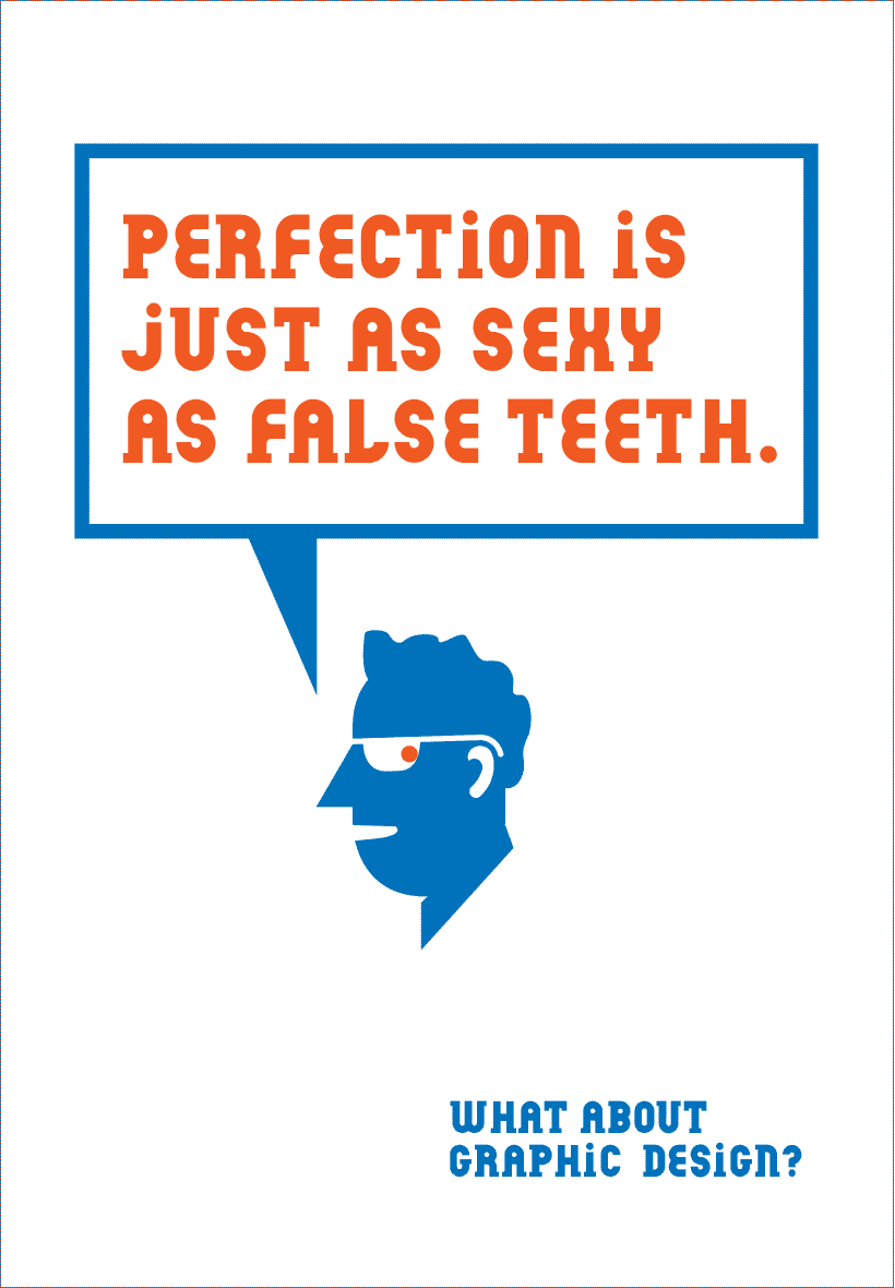
What about? personal poster 2015
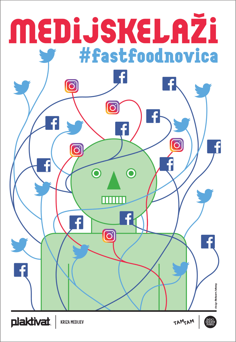
TAM-TAM Inštitut – International PLAKTIVAT competition in designing a city poster on the topic of ‘The Crisis of the Media’. This campaign is exhibited in the streets of Ljubljana 2018.
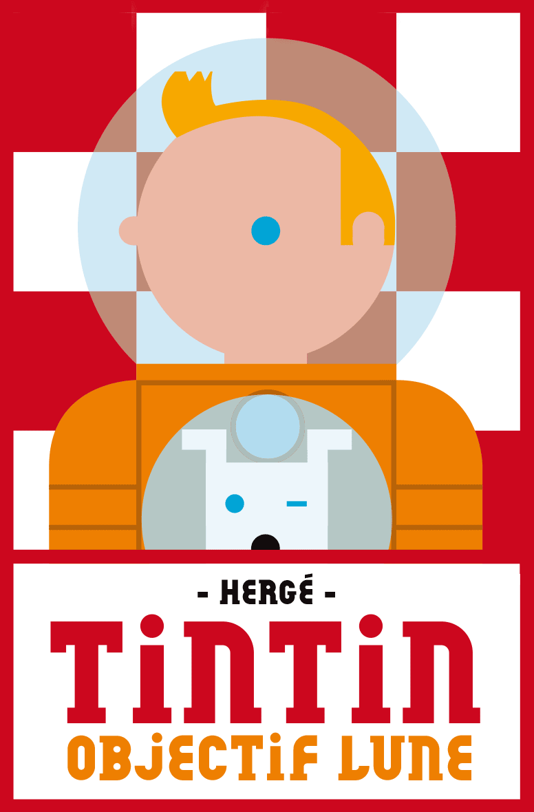
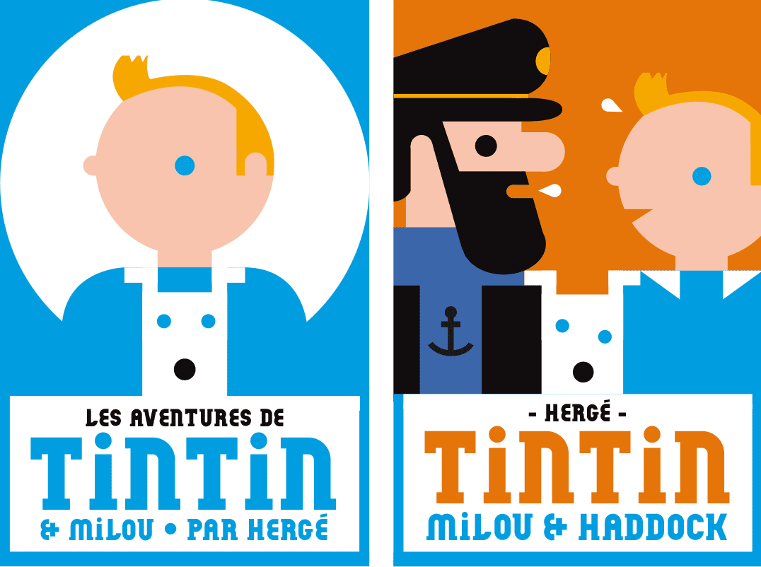
Homage to Hergé & his ‘Tintin’ 2015
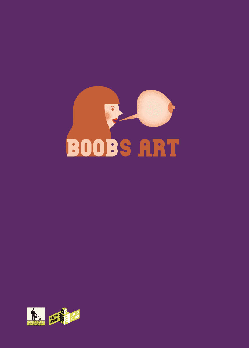
Cover catalogue « Boobs Art », exhibition ‘Huis van het Beeld / La Maison de l’Image’ Brussels 2017
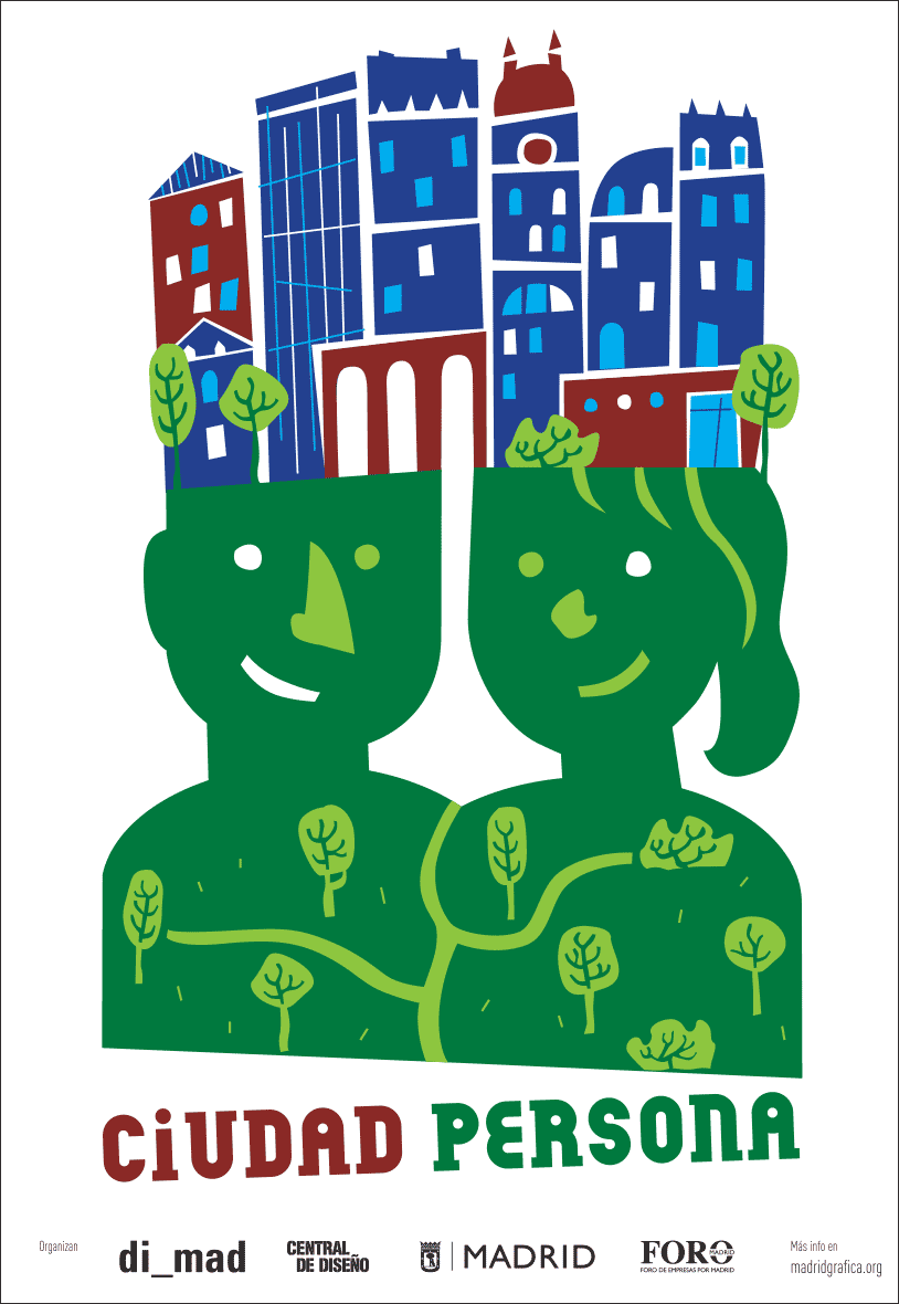
Poster for Madrid Gràfica 2018 - ‘Person City / Ciudad Persona’