First sketches’
 BACK
BACK
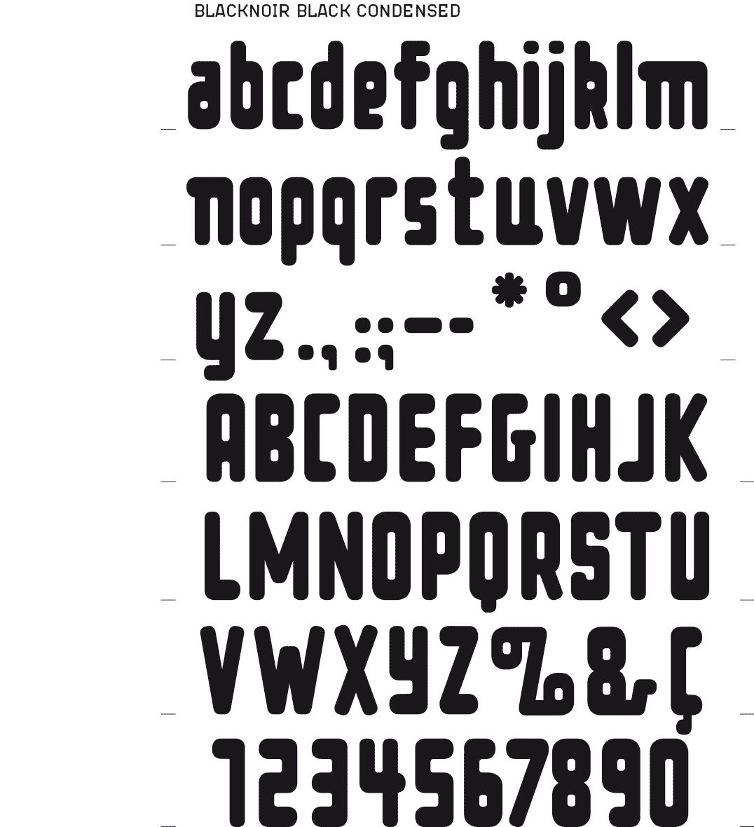
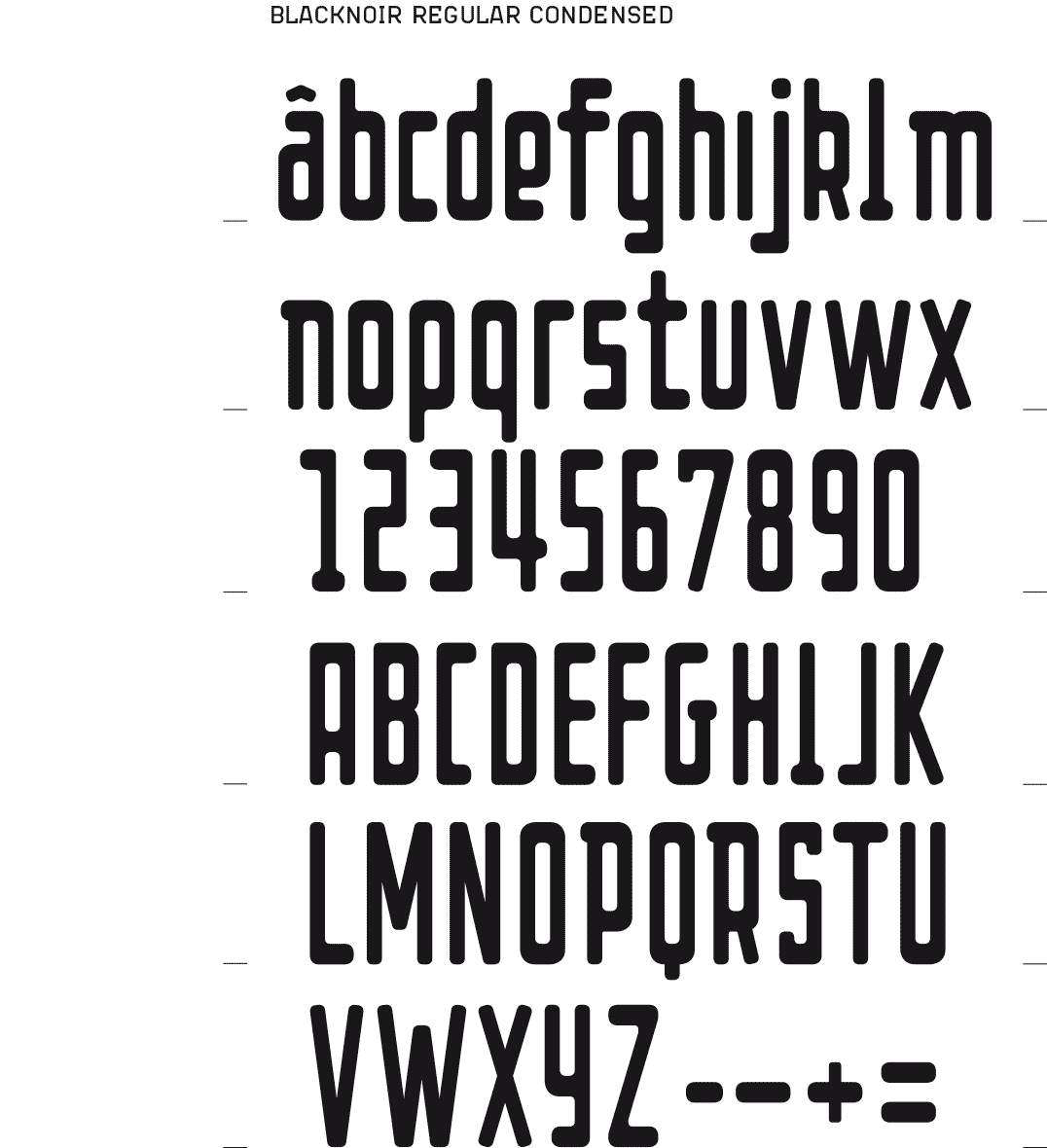
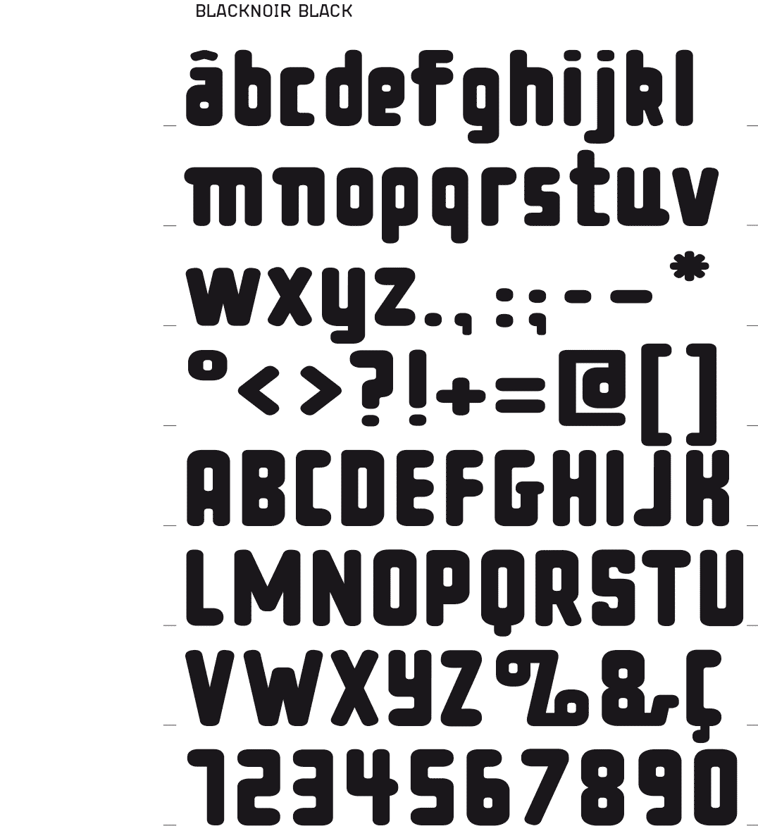
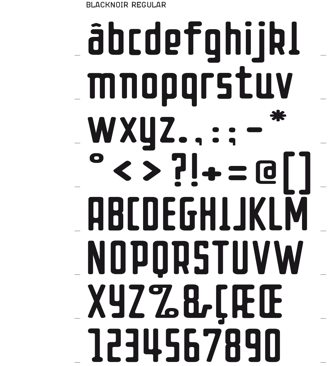
BLACKNOIR BOLD & REGULAR
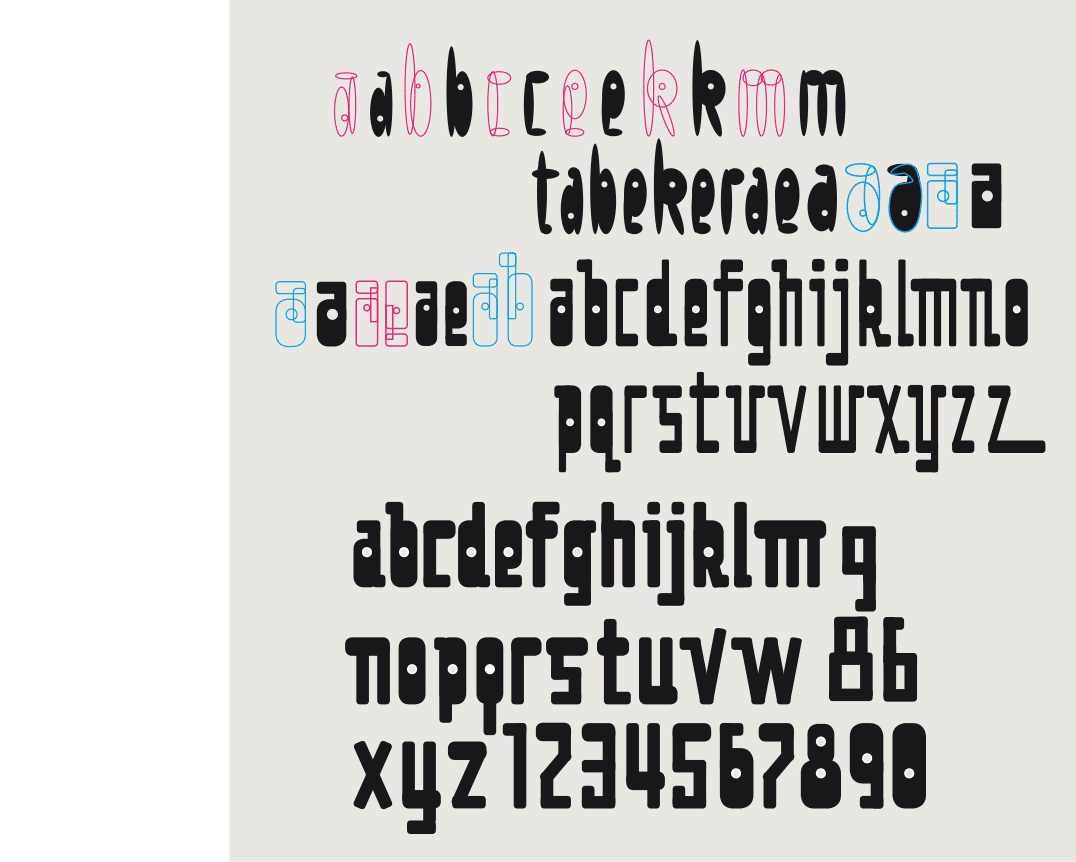
A DROP-SHAPED FONT
[2012] I tried to construct a font on the basis of oval-like shapes. The intention was to obtain a drop-shaped font type, consisting of spherical black characters. At the same time I wanted it clearly constructed, and not a freehand drawing. The result was not optimal, therefore I quickly passed from oval to rounded rectangles. Building up the letters this way was more efficient, and the results were nicer.
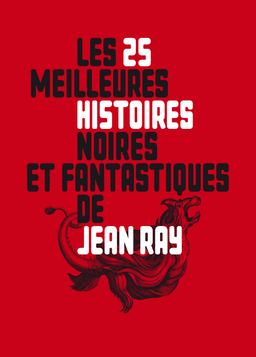
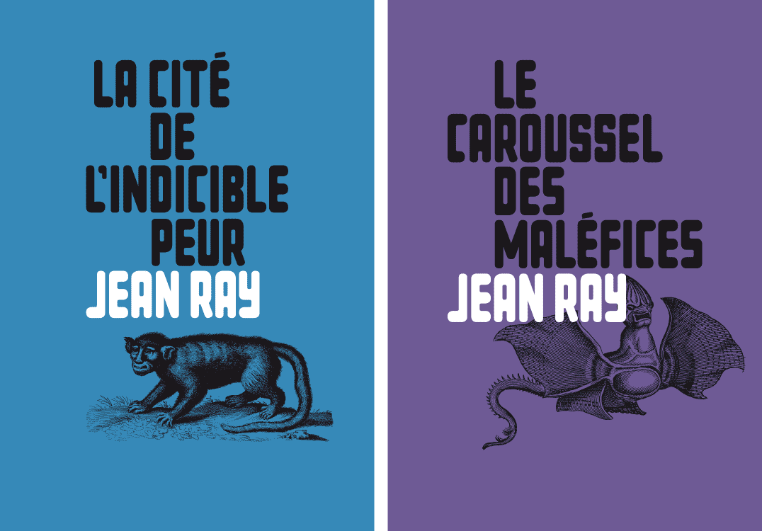
Book covers for the horror and fantasy stories by Jean Ray, font application 2014
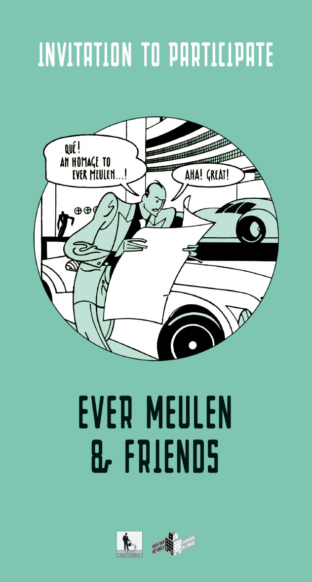
‘Invitation to participate’ in the exhibition in homage to Ever Meulen - ‘Huis van het Beeld / La Maison de l’Image’ Brussels 2017 – illustration Ever Meulen
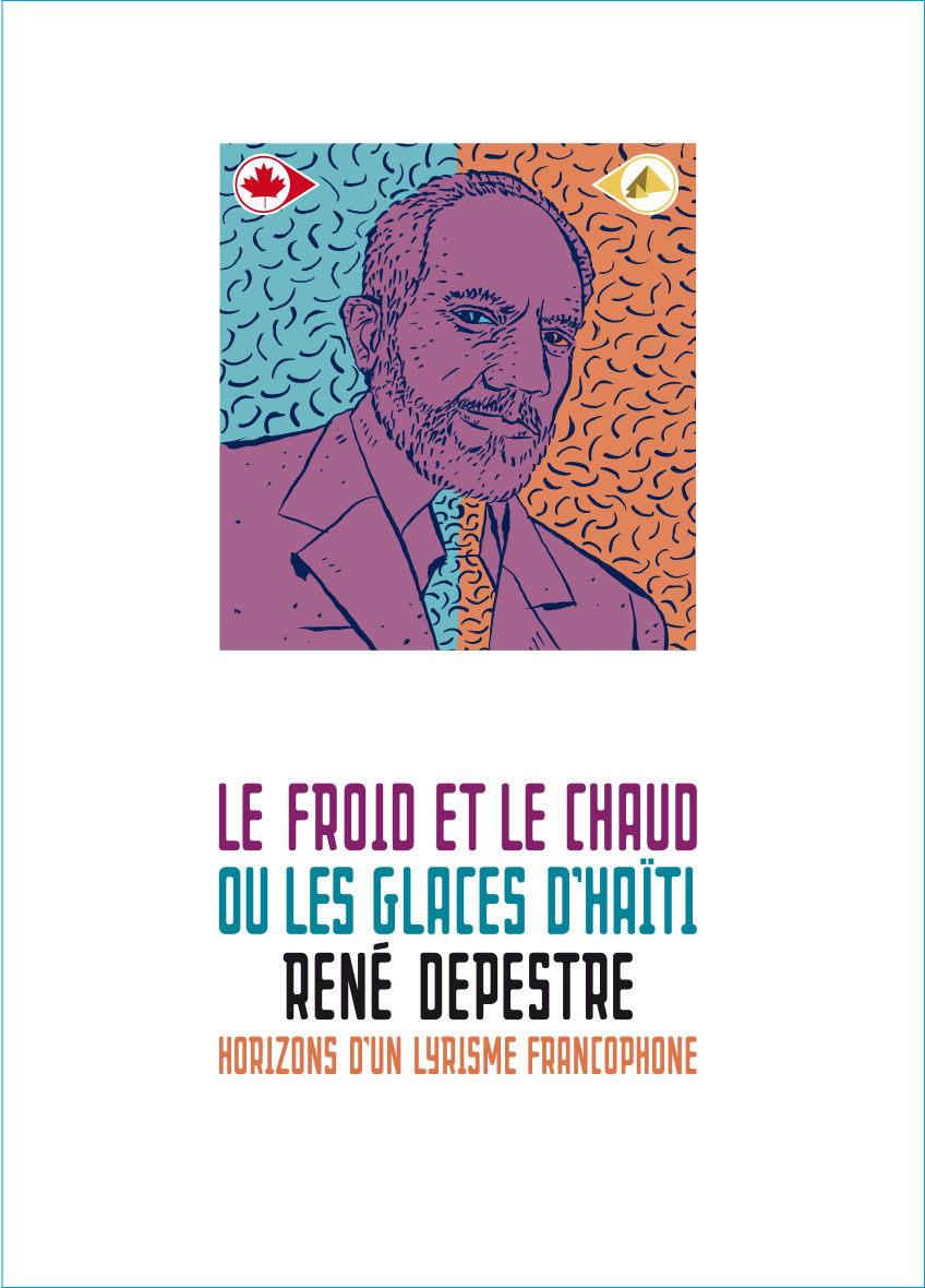
Book cover for a study about the Haitian writer and poet René Depestre - éditions Encrage Amiens, France 2012

CD cover for the Ghent based jazzgroup WOFO, 2014