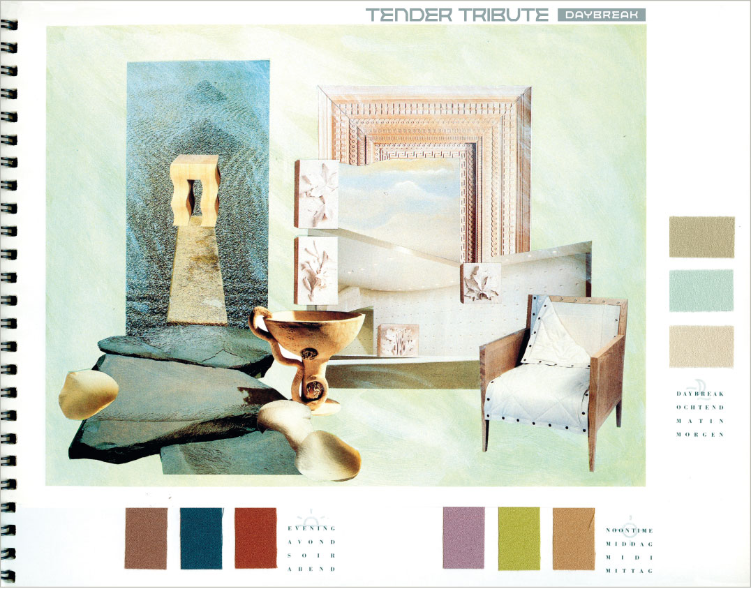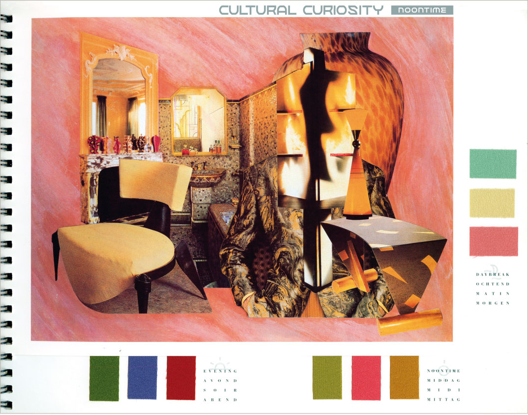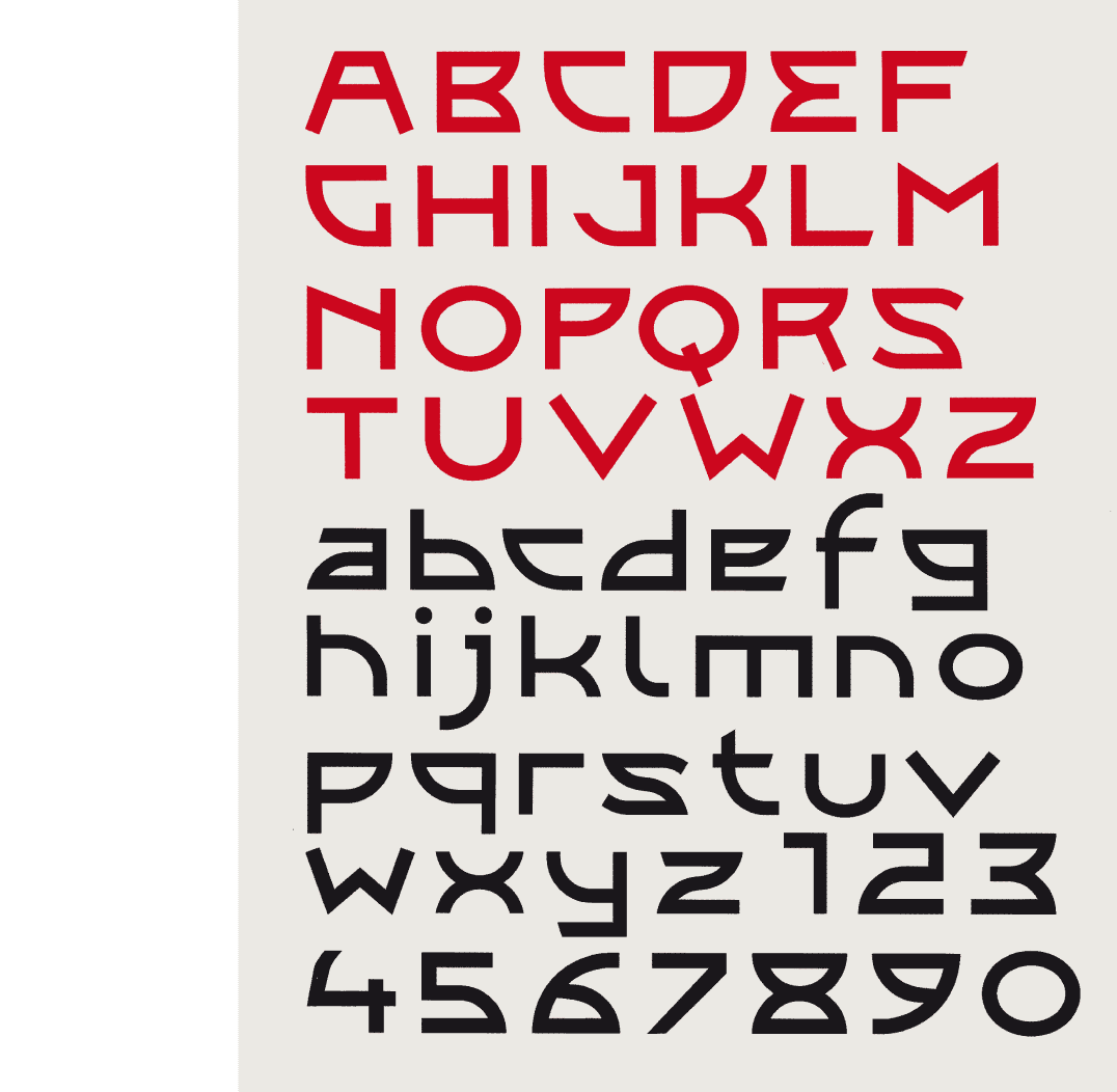
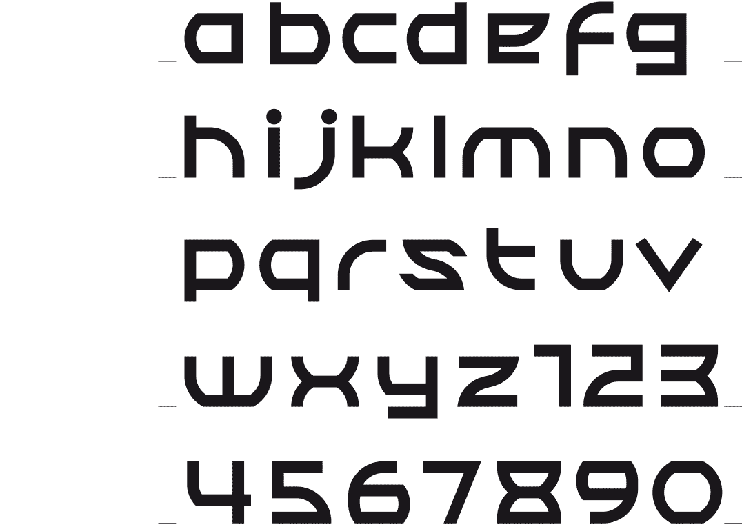
The first version of the typeface
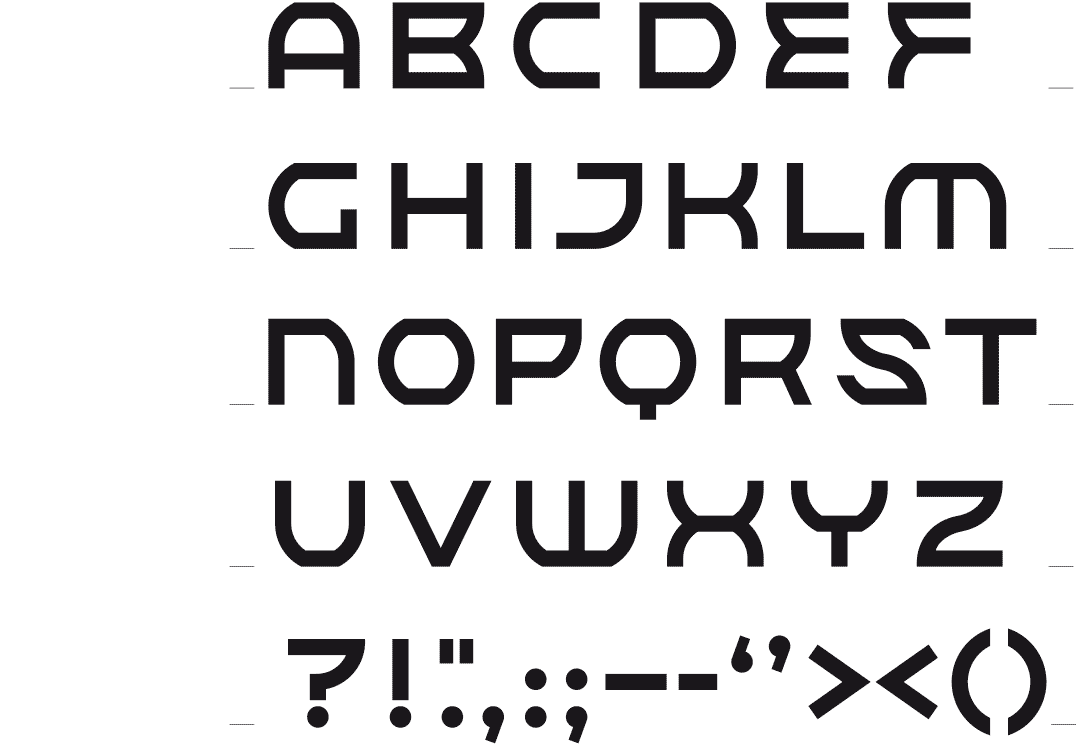
The construction method of the characters in lower and uppercase
 BACK
BACK
XORKAZ
ROUND SHAPES
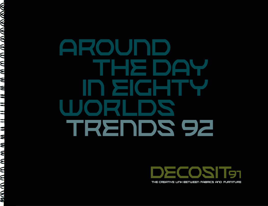
[1992-2015] A solid font with a nod to the Russian posters from the 30s and 40s. There are no flowing forms, the letters are highly structured and abruptly change from round to straight shapes. A first version of the font was not satisfactory. A makeover gave the font unity and strength.
Cover design compilation CDs of the Ham Sessions, jazz event, 2014-2015-2016