Construction Method
 BACK
BACK
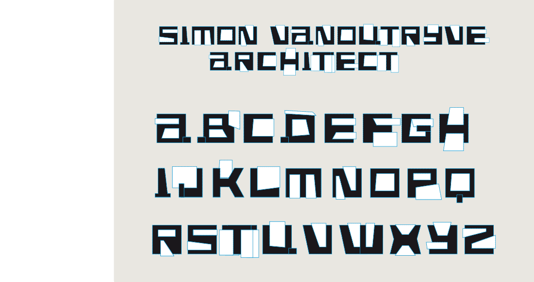
ARCHIE TECK
ARCHITECTURAL
[2003] The request of an architect friend to create his business card, incited me to design the letters of his name in architectural shapes, the result being this constructivist looking font that is inspired by life in big cities.
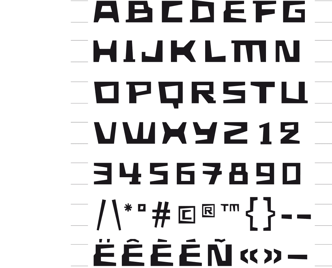
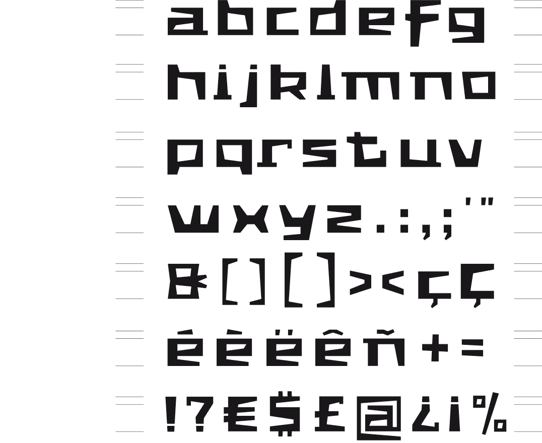
The ArchieTeck-font has broad basic shape, straight cutout forms and small outbuildings.
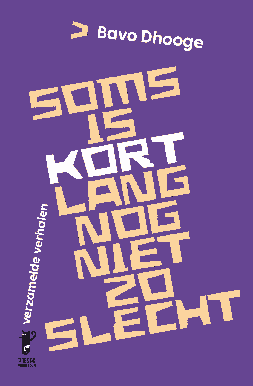
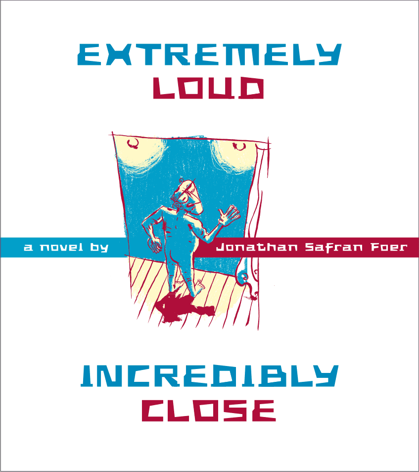
Book cover, font application 2025
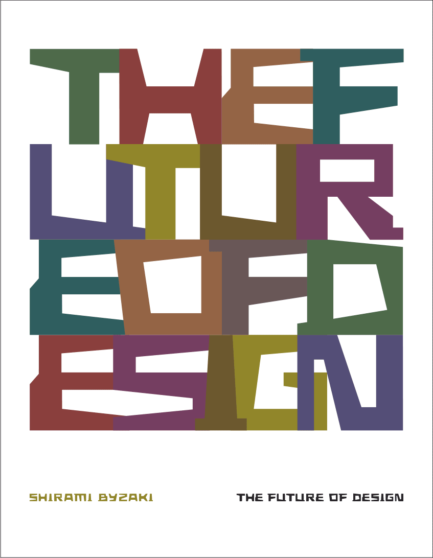
Book cover, font application 2010
Book cover, font application 2010
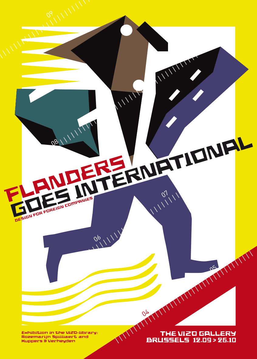
Poster for the exhibition « Flanders goes International » VIZO - Design Vlaanderen 2003
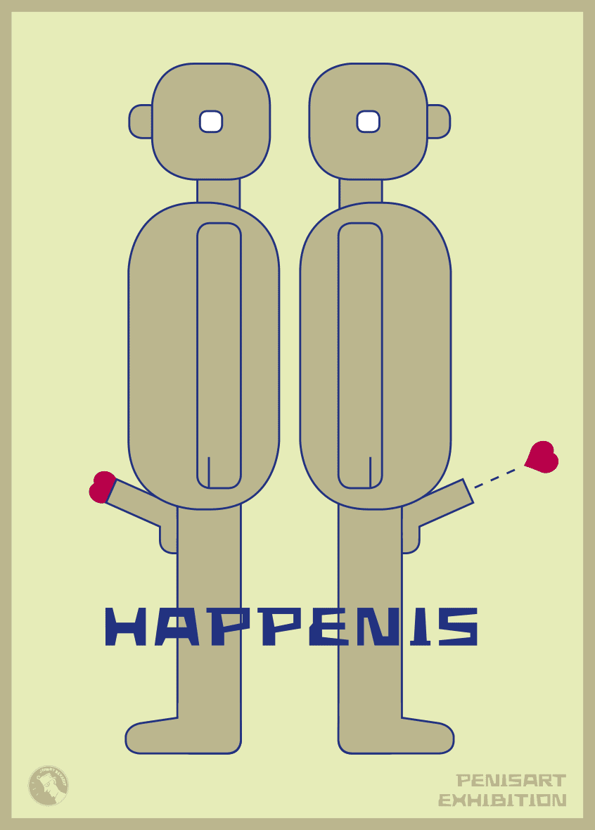
Poster for the exhibition « Pen is Art » - catalogue ‘Huis van het Beeld / La Maison de l’Image’ Brussels 2015
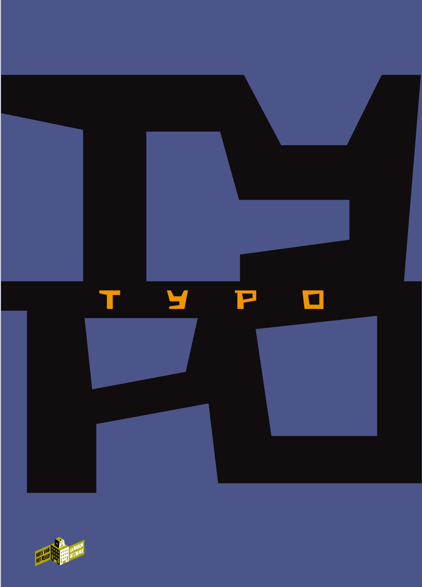
Cover catalogue, exhibition « TYPO » - ‘Huis van het Beeld / La Maison de l’Image’ Brussels 2013